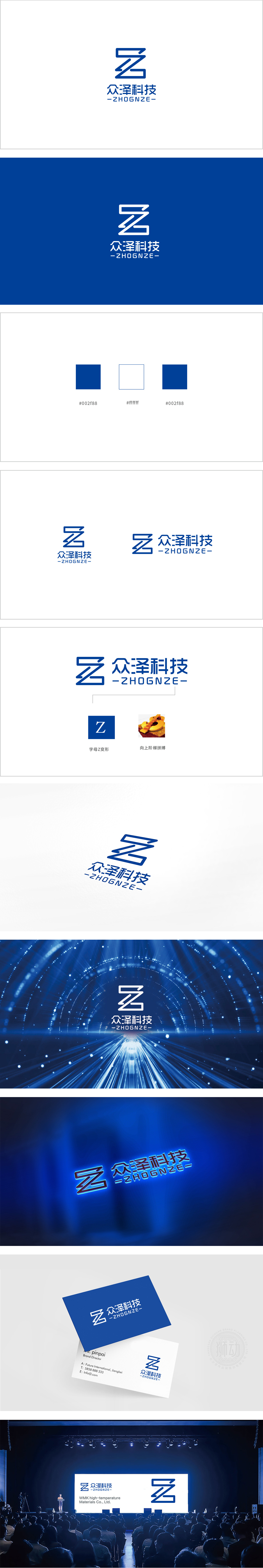
狮动设计以极简线条勾勒出品牌的硬核实力——一个充满张力的"Z"字符号,如芯片电路般精密,似代码逻辑般通透,将"众泽"的品牌基因与科技属性狠狠钉入视觉记忆。蓝色主调如深海般沉稳,却在折线转折处迸发出锐利的现代感,中文"众泽科技"与英文"ZHONGZE"以刀锋般的无衬线字体列队,与图形符号形成雷霆万钧的阵列感。这不仅是设计,更是一场用几何美学书写的科技宣言——简洁到极致,却让每一根线条都在呐喊"专业"与"颠覆"。
Lion design outlines the hard-core strength of the brand with minimalist lines-a "Z" symbol full of tension, which is as precise as a chip circuit and as transparent as code logic, and nails the brand genes and scientific and technological attributes of "Zhongze" into visual memory. The blue theme is as calm as the deep sea, but generate shows a sharp sense of modernity at the turning point of the broken line. Chinese "ZHONGZE Technology" and English "Zhongze" are lined up in a blade-like sans-serif font, forming a thunderous array sense with the graphic symbols.


扫码或拨打添加客服微信


