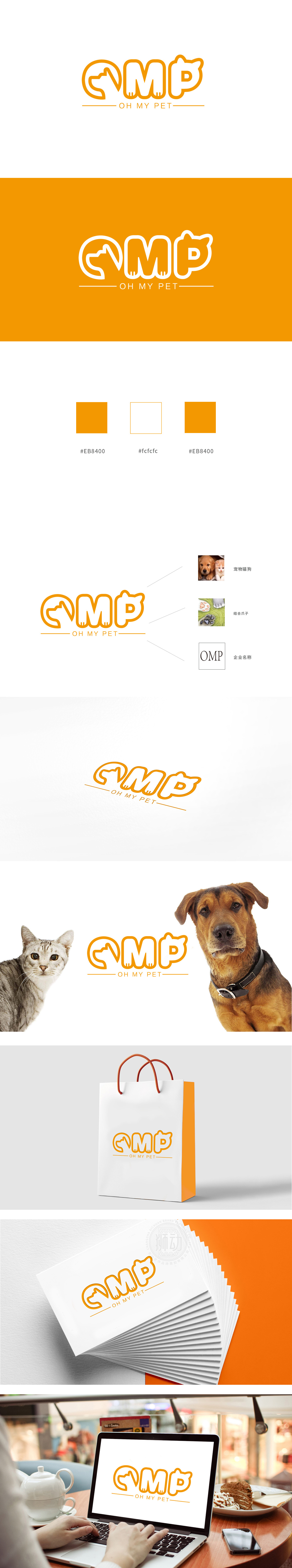
狮动设计通过“符号化语言”建立宠物认知锚点,核心图形设计——动物意象与文字的无缝嵌合主标识“OMP”以橙色为主色调(传递温暖、活力感,符合宠物食品传递的“关爱”属性),字母造型巧妙融入宠物特征:“O”字母:变形为猫咪侧脸轮廓,线条圆润柔和,又直观关联“宠物”品类;“M”“P”字母底部:嵌入猫爪/狗爪的点状纹理,强化“宠物专属”的视觉符号,传递“温和配方”“适合宠物体质”的心理暗示,整体“看到符号→联想到宠物→感知品牌温度”形成完整链路,既突出“OMP”的企业身份,又通过细节元素将“宠物食品”的品类属性与情感价值深度绑定,实现“一眼识别、情感共鸣、记忆留存”的设计目标。
Lion design establishes the pet cognitive anchor point, and the core graphic design —— the seamless combination of animal images and characters. The main logo "OMP" takes orange as the main color (conveying warmth and vitality, which conforms to the "caring" attribute of pet food delivery), and the letter shape is skillfully integrated into the pet characteristics: the letter "O" is deformed into the outline of the cat's side face, and the lines are round and soft, which is also intuitively related to the "pet" category. The bottom of the letter "M" and "P": the dotted texture of cat's paw/dog's paw is embedded, the visual symbol of "exclusive to pets" is strengthened.


扫码或拨打添加客服微信


