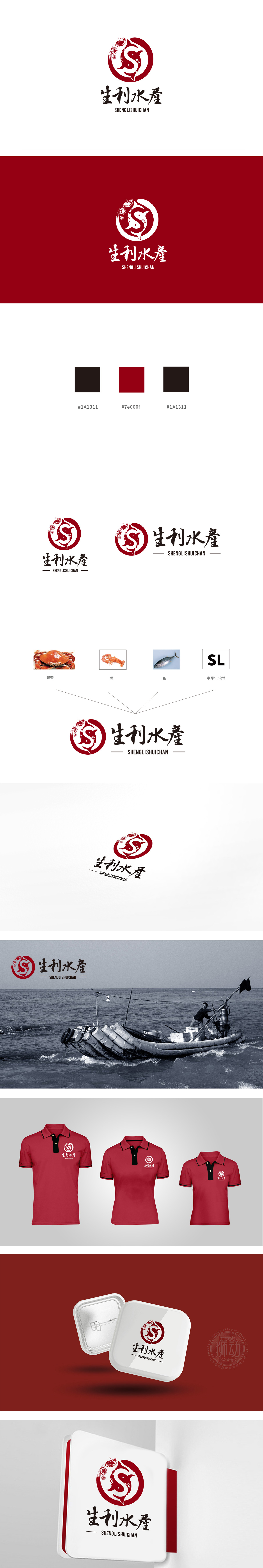
狮动设计采用红色为主色调,象征热情和活力。图形中包含两条鱼,形成一个圆形,寓意圆满和和谐。鱼的形态简洁流畅,具有动感,象征着水产的鲜活和灵动。双鱼图案不仅代表了水产的主要产品,还蕴含了双鱼座的和谐与灵动,增加了设计的文化底蕴,设计突出了自然生产环境和高品质的水产品,文化内涵和行业契合度上表现出色。
Lion design uses red as the main color, symbolizing enthusiasm and vitality. The figure contains two fish, forming a circle, which means perfection and harmony. The shape of fish is simple, smooth and dynamic, which symbolizes the freshness and agility of aquatic products. The pattern of Pisces not only represents the main products of aquatic products, but also contains the harmony and agility of Pisces, which increases the cultural connotation of the design.


扫码或拨打添加客服微信


