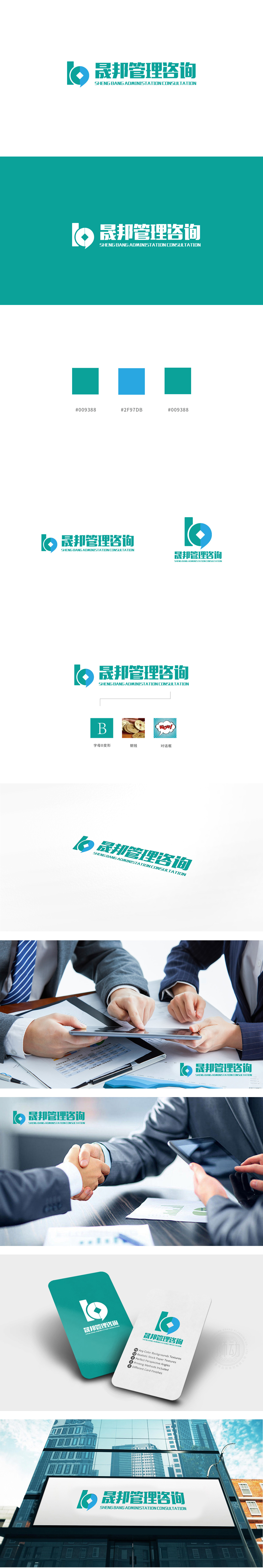
狮动设计以“B”字母为基底,通过流畅的曲线与几何切割形成视觉焦点:绿色直角结构:竖直线条刚硬稳定,象征“管理咨询”的专业性、结构化与可靠性,传递企业在战略规划、流程优化上的严谨性。蓝色圆形/对话气泡:柔和的曲线包裹绿色结构,形似“对话气泡”或“循环符号”,既体现咨询行业“沟通、协作”的核心属性,也暗含“可持续发展、 LOGO通过“对话气泡”“钱币”等隐喻,精准传递了咨询服务的关键价值——沟通(气泡)、专业(绿色)、精准(菱形)、持续(循环),传递“创新型咨询机构”的形象。
Lion design is based on the letter "B", which forms the visual focus through smooth curve and geometric cutting: green right-angle structure: rigid and stable vertical lines, which symbolizes the professionalism, structure and reliability of "management consulting" and conveys the rigor of enterprise in strategic planning and process optimization.Blue circle/dialogue bubble: the soft curve is wrapped in a green structure, which looks like "dialogue bubble" or "circular symbol". It not only embodies the core attributes of "communication and cooperation" in the consulting industry.


扫码或拨打添加客服微信


