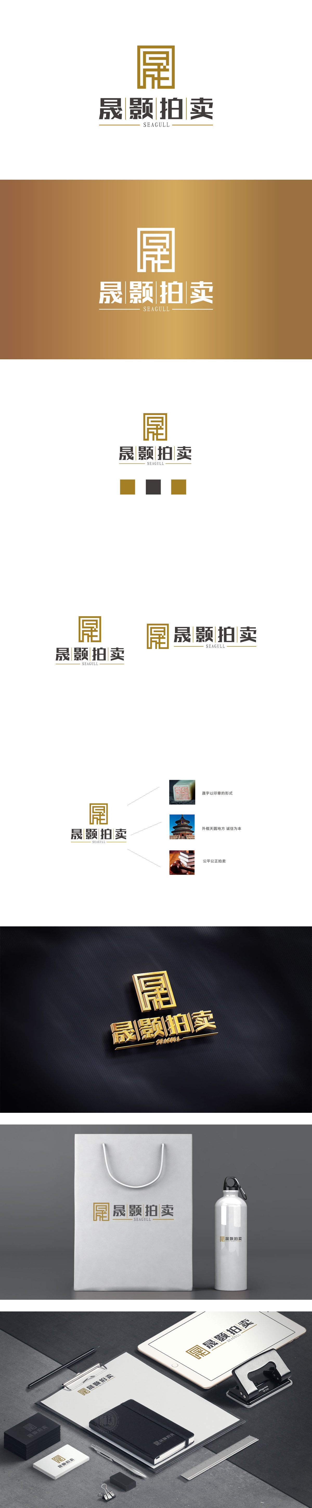
狮动设计采用以「晟」字(品牌首字)为核心变形,用回字形框架(中国传统建筑元素)包裹,既强化了品牌名称的识别性,又自带「古董、艺术品」的文化底蕴(拍卖行业的核心关联);线条采用「直线+折线」的组合,简洁利落却有层次感,像一把「打开宝藏的钥匙」,暗示拍卖行业「挖掘价值」的属性;金色配色更是点睛之笔——这种「帝王色」自带「珍贵、高端」的质感,完美匹配拍卖品(古董、艺术品、奢侈品)的价值感,瞬间拉高品牌的「权威感」。用「符号化」的语言解决了品牌的核心需求。
Lion design takes the word "Sheng" (brand initials) as the core deformation, and is wrapped in a zigzag frame (China traditional architectural elements), which not only strengthens the recognition of brand names, but also brings the cultural connotation of "antiques and artworks" (the core connection of auction industry); The line adopts the combination of "straight line+broken line", which is simple and neat but has a sense of hierarchy, like a "key to open a treasure", suggesting the attribute of "mining value" in the auction industry; Gold color matching is the crowning touch-this kind of "imperial color" has its own "precious and high-end" texture, which perfectly matches the sense of value of auction items (antiques, artworks and luxury goods) and instantly enhances the brand's "authority". Solve the core needs of the brand with symbolic language.


扫码或拨打添加客服微信


