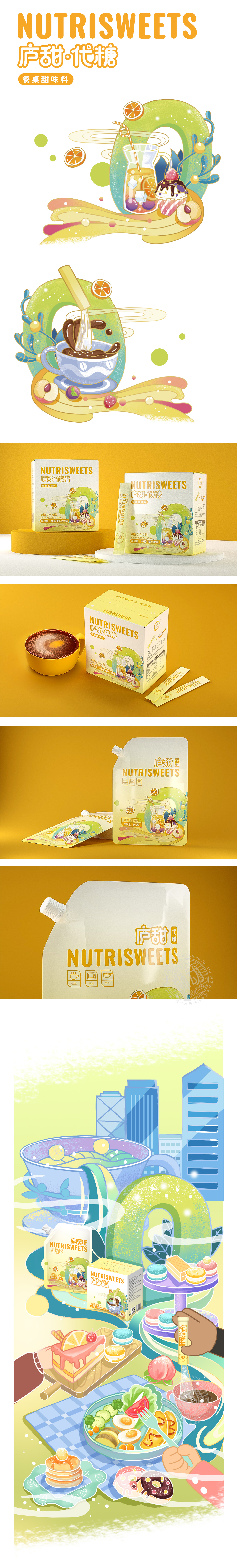
狮动设计以低饱和黄+青柠绿 黄色作为“甜味”的经典视觉符号,搭配青柠绿的“清新/低负担”感,又通过冷暖色平衡传递“天然代糖”的健康属性。背景采用统一的暖黄色,与产品主体的黄绿撞色形成层次,突出“食欲友好“氛围。用“0”和“流动感”传递核心卖点,通过曲线和流体形态(如杯中的吸管、滴落的糖粒)传递“易溶解、顺滑口感”的产品特性。插画风格偏向扁平化+轻质感,水果切片、玻璃杯中的气泡、蛋糕奶油等元素线条简洁但,用消费者熟悉的食物符号建立“代糖=替代蔗糖,适配多种饮食场景”的认知整体风格:年轻化、轻质感,让“代糖”从“功能替代品”变成了“生活方式选择”的一部分。
Lion design takes low saturated yellow+lime green yellow as the classic visual symbol of "sweetness", and with the "freshness/low burden" feeling of lime green, it also conveys the health attribute of "natural sugar substitute" through the balance of cold and warm colors. The background is a uniform warm yellow, which contrasts with the yellow-green color of the main product to form a hierarchy, highlighting the "appetite-friendly" atmosphere. Use "0" and "fluidity" to convey the core selling point, and convey the product characteristics of "easy to dissolve and smooth taste" through curves and fluid forms (such as straws in cups and dripping sugar particles). The illustration style tends to be flat+light texture, and the lines of fruit slices.


扫码或拨打添加客服微信


