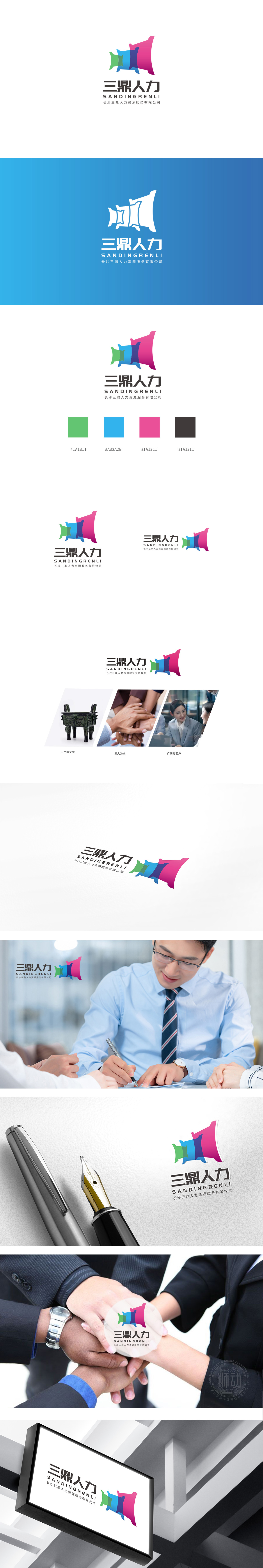
狮动设计采用由三个色彩渐变的“鼎”形抽象图形构成,整体呈现出向上汇聚的动态感,既贴合公司名称中的“三鼎”,又通过视觉符号传递品牌定位:“鼎”的文化隐喻:鼎是中国传统文化中象征“稳定、权威、协作”的器物,与人力资源服务“赋能组织、聚合人才”的核心价值高度契合,传递企业稳重可靠的专业形象。LOGO采用绿、蓝、粉(或紫)三色渐变,色彩搭配兼具行业适配性与情感共鸣:渐变处理,隐喻“人才成长—专业服务—价值升华”的闭环。该LOGO以“鼎”的文化内核+现代设计语言,形成差异化记忆点。整体设计兼顾“专业可靠”与“温暖包容”。
Lion Design is composed of three Ding-shaped abstract figures with gradually changing colors, showing a dynamic sense of upward convergence as a whole, which not only fits the "Three Ding" in the company name, but also conveys the cultural metaphor of the brand positioning through visual symbols: Ding is a symbol of "stability, authority and cooperation" in China traditional culture, which is highly consistent with the core value of human resources service "empowering organizations and aggregating talents". LOGO adopts green, blue, pink (or purple) three-color gradient, and the color matching has both industry adaptability and emotional resonance: gradient treatment, which means the closed loop of "talent growth-professional service-value sublimation".


扫码或拨打添加客服微信


