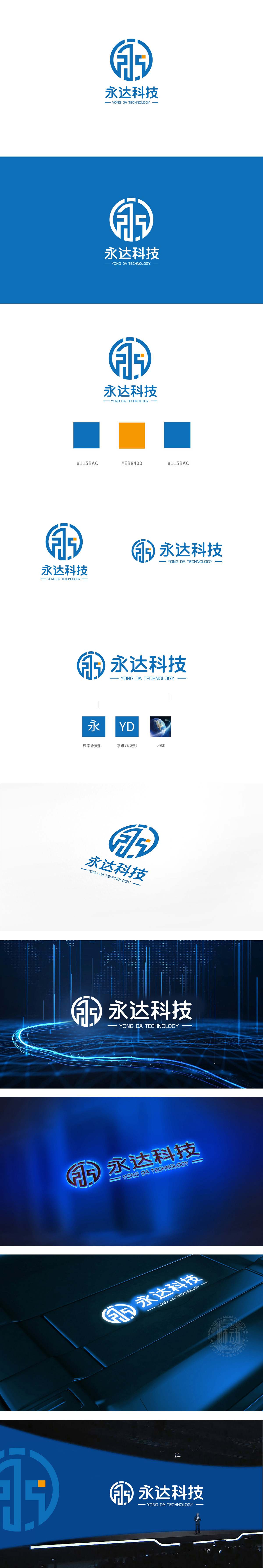
狮动设计采用“汉字永变形”:强化品牌“永”字的文化符号,突出“长久经营”的品牌承诺,呼应科技企业对“技术迭代与持续发展”的追求。“字母YD变形”:体现科技行业的“简洁、高效”特质,同时为国际化传播提供视觉简化符号.“地球图形”:以蓝色星球搭配环绕光带,直接关联“科技赋能全球”的愿景,与圆形LOGO的轮廓形成“微观符号(企业)—宏观愿景(世界)”的呼应,暗示品牌的行业定位与格局。通过蓝色(专业)、橙色(创新)、地球(全球)等符号,快速传递“科技行业属性”“长久发展理念”“国际化视野”三大核心信息。
Lion Design adopts "permanent deformation of Chinese characters": it strengthens the cultural symbol of the brand "forever", highlights the "long-term management" of brand promise, and echoes the pursuit of "technical iteration and sustainable development" by scientific and technological enterprises."YD Distortion" embodies the characteristics of "conciseness and high efficiency" in the science and technology industry, and at the same time provides visual simplified symbols for international communication. "Earth Graphics" directly relates to the vision of "enabling the world through science and technology" with the blue planet, and echoes with the outline.


扫码或拨打添加客服微信


