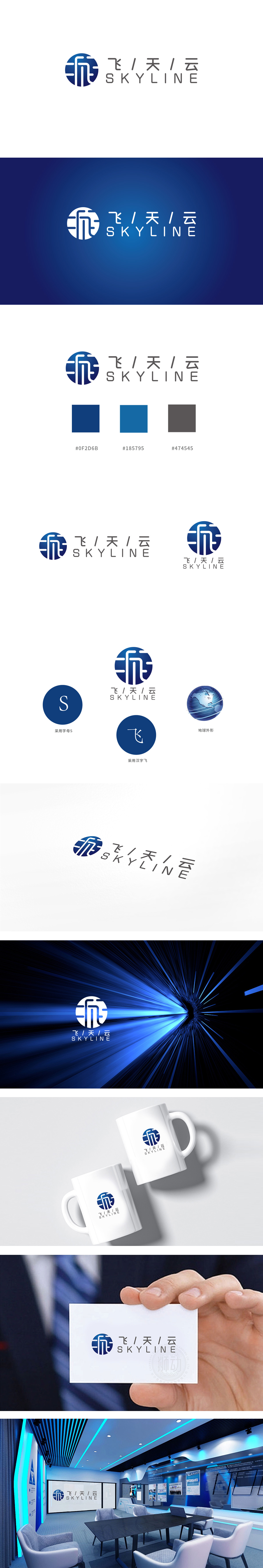
狮动设计以白色线条构建出抽象符号,形似“飞”字的书法笔触与几何线条结合——竖线与曲线形成动态张力,横向短线条如同云层的切割或飞行轨迹,既保留了汉字“飞”的意象骨架,又通过简化处理增强了现代感和识别度。线条之间的留白形成流动感,暗示“云”的无界与科技的连接属性,整体图形简洁而不简单,符合科技品牌“高效、精准”的调性,同时通过线条的倾斜角度,传递向上的动感,暗合“飞天”的进取精神。图形、色彩、文字均紧扣“飞天”“云”的核心意象,传递科技、广阔、可靠的品牌气质。
Liondesign uses white lines to construct abstract symbols, and the calligraphy strokes resembling the word "flying" are combined with geometric lines-vertical lines and curves form dynamic tension, and the horizontal short lines are like the cutting or flying trajectory of clouds, which not only retains the image skeleton of Chinese characters "flying", but also enhances the sense of modernity and recognition through simplified processing. The blank space between lines forms a sense of fluidity, which implies the boundlessness of "cloud" and the connection property of science and technology.


扫码或拨打添加客服微信


