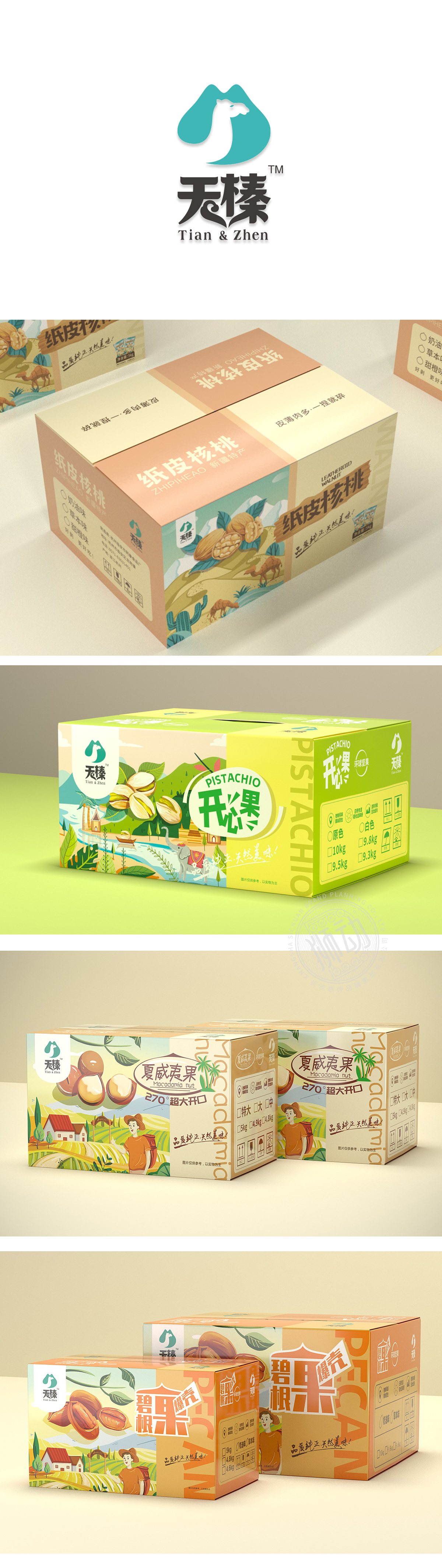
狮动设计采用以流畅的蓝绿色曲线构成抽象轮廓,整体形似纵向剖开的坚果截面,形成自然的“果壳包裹果仁”的意象,直接呼应“坚果”品类属性。内部留白部分巧妙勾勒出骆驼的侧影轮廓——弯曲的脖颈、突出的驼峰与头部线条浑然一体,动物形象的优雅与坚韧感,暗含品牌“天然、稳健、源自自然”的定位。蓝绿色调传递清新、健康、天然的视觉感受,符合坚果产品“原生态、无添加”的消费心理;整体简洁而不单调。 “榛”字直接点明核心品类,且“榛”与“珍”谐音,暗含“珍贵、优质”;“天”则强调“天然、天赐”,与骆驼象征的“自然来源”形成呼应,强化“源于自然的优质坚果”品牌主张。
Lion design uses a smooth blue-green curve to form an abstract outline, which looks like a nut section cut vertically, forming a natural image of "the shell is wrapped in nuts", directly echoing the category attribute of "nuts". The blank part in the interior cleverly outlines the profile of the camel-the curved neck, the prominent hump and the head line are integrated, and the elegance and tenacity of the animal image imply the positioning of the brand as "natural, steady and natural". The blue-green tone conveys a fresh, healthy and natural visual feeling, which is in line with the consumption psychology of "original ecology, no addition" of nut products; The whole is concise and not monotonous.


扫码或拨打添加客服微信


