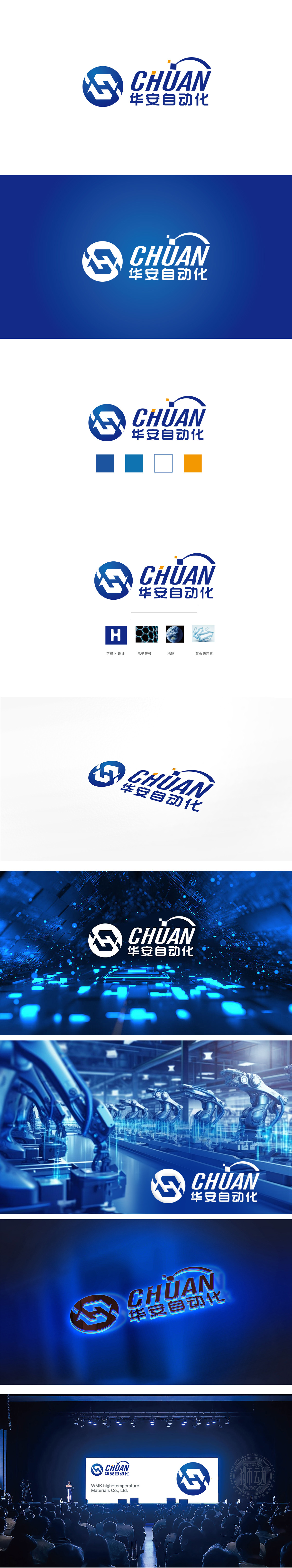
狮动设计以蓝色渐变圆形为基底,嵌入由白色线条构成的抽象符号:动态循环感:线条呈现“交叉环绕”的螺旋结构,形似机械传动中的齿轮咬合轨迹,又暗含“循环往复”的自动化流程逻辑,直观呼应“自动化”行业属性;字母与图形的融合:符号巧妙融入“华”字拼音首字母“H”的变体,同时通过线条的穿插形成“安”字的结构联想,实现品牌名称与图形的隐性绑定,增强记忆点。精准定位“工业自动化”的视觉语言。
Lion design is based on the blue gradient circle, embedded with abstract symbols composed of white lines: dynamic circulation: the lines present a spiral structure of "cross-surrounding", which looks like the meshing track of gears in mechanical transmission, and implies the automatic process logic of "cycle", which intuitively echoes the industrial attribute of "automation"; The combination of letters and graphics: symbols are skillfully integrated into the variation of the first letter "H" of "Hua", and at the same time, the structural association of "An" is formed through the interpenetration of lines.


扫码或拨打添加客服微信


