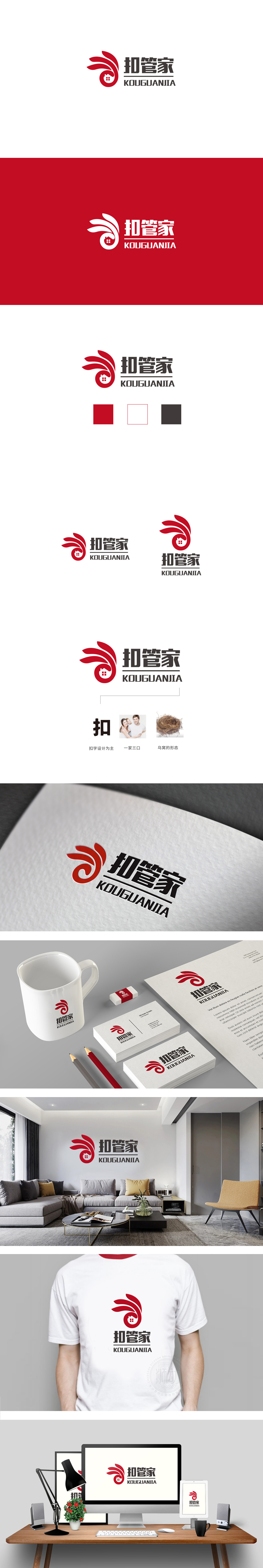
狮动设计采用三组渐变红色的弧形线条从左下向右上延伸,线条末端微微上扬,形成舒展、流动的动态感,既像凤凰展翅的羽翼(传递吉祥、守护的寓意),又似一双环绕的手(呼应“管家”的服务属性——包裹、保护、周全)。嵌入抽象的“房子”剪影,直接点明“家”的核心场景,与“管家”服务形成强关联,通过 “图形象征功能+文字明确属性+色彩强化情感” 的三重逻辑,构建了完整的品牌认知体系,传递“贴心、可靠”的服务温度;整体呈现 “凤凰羽翼”与“保护手势”的双重意。
Lion Design adopts three groups of curved lines with gradual red color extending from bottom left to top right, and the ends of the lines are slightly raised, forming a sense of stretching and flowing, which is both like the wings of a phoenix spreading its wings (conveying the meaning of auspiciousness and guarding) and like a pair of encircling hands (echoing the service attributes of "housekeeper"-wrapping, protection and comprehensiveness). Embedding the abstract silhouette of "house" directly points out the core scene of "home" and forms a strong connection with "housekeeper" service. Through the triple logic of "graphic symbolic function+clear text attribute+color to strengthen emotion".


扫码或拨打添加客服微信


