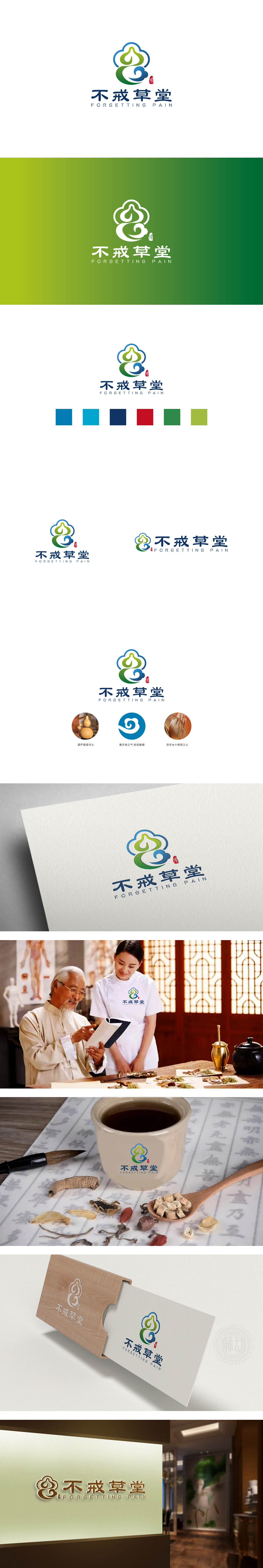
狮动设计以多层云朵轮廓构建轻盈、包容的视觉框架,既呼应“草堂”的自然属性,又传递“疗愈、平和”的品牌基调。绿色与蓝色交织的抽象形态,隐喻“自然能量的流动与循环”。顶部“芽尖”状设计(绿色尖端+白色留白)向上延伸,既像初生的嫩芽,象征“生机与希望”,又暗合中医“固本培元”的理念,强化品牌的健康属性。通过**“自然意象抽象化+文化符号现代化”**的手法,成功将“传统草堂”的东方哲学与“现代健康管理”的品牌定位融合:既通过云、芽、印章等元素唤醒用户对“自然、传统、可靠”的认知,又以轻盈的线条、明快的色彩和流畅的动态感贴近年轻群体审美,让“不戒草堂”的品牌形象兼具文化深度与商业传播力。
Lion Design builds a light and inclusive visual framework with multi-layer cloud outlines, which not only echoes the natural attributes of "Caotang", but also conveys the brand tone of "healing and peace". The abstract form of interweaving green and blue is a metaphor for "the flow and circulation of natural energy". The top "bud tip" design (green tip+white blank) extends upward, which not only symbolizes "vitality and hope" like a newborn bud, but also coincides with the concept of "consolidating the foundation and cultivating the yuan" in traditional Chinese medicine, strengthening the brand's health attributes. By means of * * "abstraction of natural images+modernization of cultural symbols".


扫码或拨打添加客服微信


