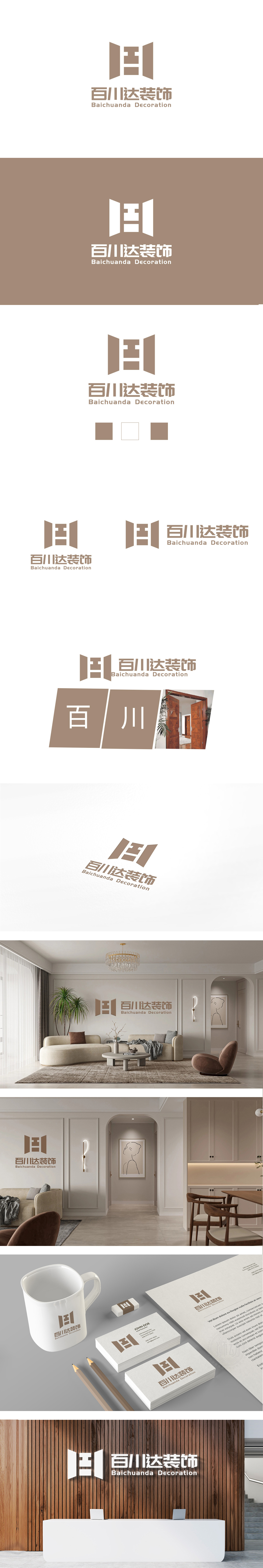
狮动设计以两个对称的三角形与中间的“工”字结构组成,整体形似一扇打开的门(或窗)倾斜的线条赋予图形动态感,象征“开放”“迎接”,三角形的稳定性传递品牌可靠、专业的形象。留白区域形成自然的视觉通道,又暗喻“空间通透”,与装饰行业追求的“开阔、舒适”空间理念相契合。通过“具象符号(门)+ 抽象语义(工/达)+ 色彩质感”**的三重结合,精准诠释了“百川达装饰”的专业定位:既突出“工程工艺”的严谨,又强调“空间创造”的开放与温度。
LionDesign is composed of two symmetrical triangles and an I-shaped structure in the middle. The overall shape is like an open door (or window), which gives the graphic a dynamic feeling and symbolizes "openness" and "welcome". The stability of the triangle conveys the brand's reliable and professional image. The blank area forms a natural visual channel, which is also a metaphor for "transparent space", which is in line with the "open and comfortable" space concept pursued by the decoration industry. Through the triple combination of "concrete symbol (door)+abstract semantics .


扫码或拨打添加客服微信


