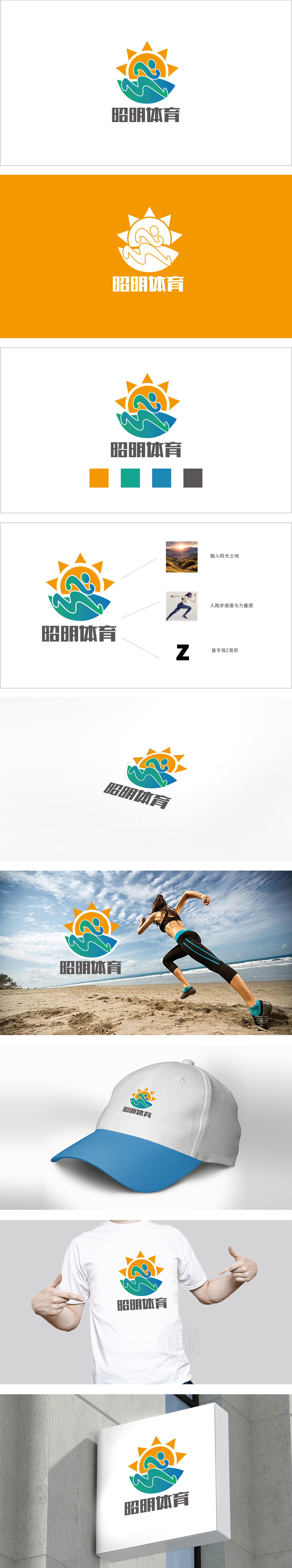
狮动设计以流畅的曲线勾勒出跑步时的“爆发姿态”又通过“Z”字形的变形强化了动态张力,精准传递少儿运动中“轻盈、敏捷、充满潜能”的特质,而非单纯的力量竞技。橙色太阳造型与蓝绿色“土地/山丘”轮廓,直接关联“阳光土地”。这种设计暗合少儿体育“亲近自然、户外探索”的核心场景,橙色象征活力与温暖(如阳光普照),蓝绿色则传递安全、包容的成长空间,视觉上给人开放、积极的第一印象,契合儿童对自然运动的向往。这种“活力(图形)+ 可靠(文字)”的搭配,精准戳中家长对少儿体育机构的核心诉求——既要让孩子享受运动,也要有专业的引导保障。
Lion design outlines the "explosive posture" during running with a smooth curve, and strengthens the dynamic tension through the deformation of the "Z" shape, accurately conveying the characteristics of "lightness, agility and full of potential" in children's sports, rather than simply strength competition. The orange sun shape and the blue-green "land/hill" outline are directly related to the "sunny land". This design coincides with the core scene of children's sports "close to nature and outdoor exploration". Orange symbolizes vitality and warmth (such as sunny), while blue-green conveys safe and inclusive growth space, giving people an open and positive first impression visually, which is in line with children's yearning for natural sports.


扫码或拨打添加客服微信


