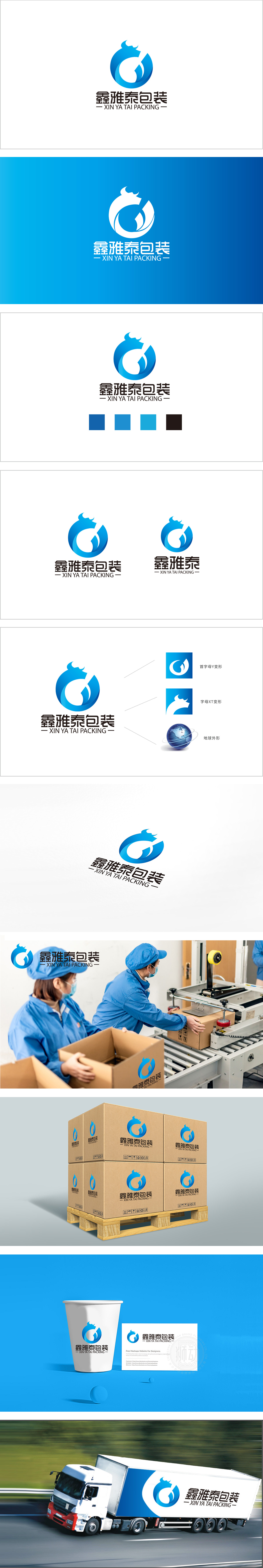
狮动设计采用以蓝色环形流线为基底,嵌套抽象化的牛头轮廓,整体呈“O”形环抱结构。环形线条既象征包装行业的“包裹、保护”属性,又传递出循环、圆满的视觉感受;牛头的提炼则通过简练的曲线勾勒出牛角与面部轮廓,赋予标志“稳健、开拓”的精神象征,同时与“鑫雅泰”的首字母变形巧妙结合。主色调采用深蓝色,既符合包装行业专业、可靠的属性,又通过蓝色的沉稳感传递品牌值得信赖的形象。蓝色的专业底色、牛的力量符号、环形的包装隐喻,以及全球化的地球元素,共同服务于“鑫雅泰包装”的品牌定位,展现出设计对品牌内核的精准提炼与视觉转译能力。
Lion design adopts the abstract outline of the bull's head nested on the blue annular streamline, and the overall structure is "O"-shaped. The circular line not only symbolizes the "wrapping and protection" attribute of the packaging industry, but also conveys a circular and complete visual experience; The extraction of the bull's head outlines the outline of the horn and face through concise curves, giving the symbol a spiritual symbol of "steadiness and pioneering", and at the same time skillfully combining with the deformation of the first letter of "Xinyatai". The main color is dark blue, which not only conforms to the professional and reliable attributes of the packaging industry, but also conveys the trustworthy image of the brand through the calm feeling of blue.


扫码或拨打添加客服微信


