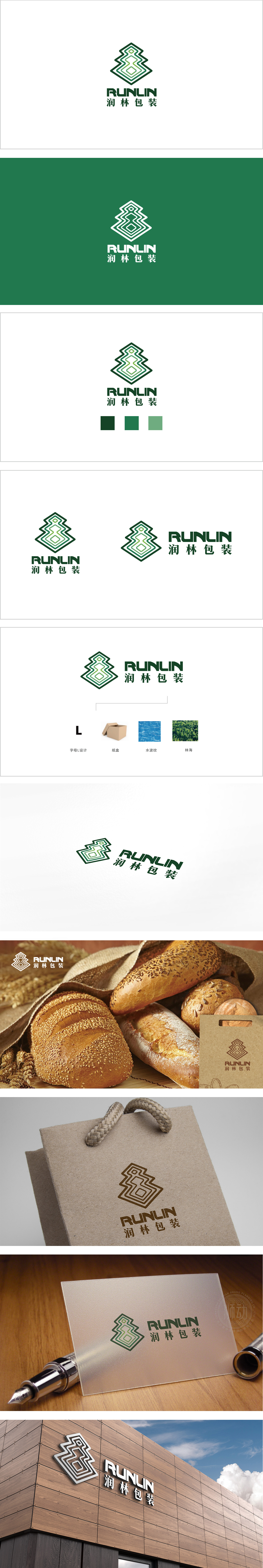
狮动设计由绿色渐变线条构成的抽象图形,字母“L”的结构性贯穿:通过线条的转折与嵌套,将字母轮廓转化为图形的“骨骼”,既呼应品牌名称“润林)”中的首字母“L”,提升抽象美感。图形内部的菱形与阶梯状线条,直接关联“包装”行业属性,同时通过线条的重复嵌套,强化“包装防护”的安全感。“水波纹”与“林海”的意象融合,两种自然意象通过同一组线条表达,形成“一水一木,润养共生”的视觉隐喻,用最凝练的图形,讲最完整的品牌故事,初见是抽象的几何艺术,细品是行业属性与品牌文化的深度绑定。
Lion design is an abstract figure composed of green gradient lines, and the letter "L" runs through the structure: through the turning and nesting of lines, the outline of the letter is transformed into the "skeleton" of the figure, which not only echoes the initial letter "L" in the brand name "Runlin", but also enhances the abstract aesthetic feeling. The diamond-shaped and stepped lines in the figure are directly related to the industry attribute of "packaging", and at the same time, the sense of security of "packaging protection" is strengthened through repeated nesting of lines. The images of "water ripple" and "beautiful forest" are integrated, and the two natural images are expressed through the same set of lines, forming a visual metaphor of "one water, one tree.


扫码或拨打添加客服微信


