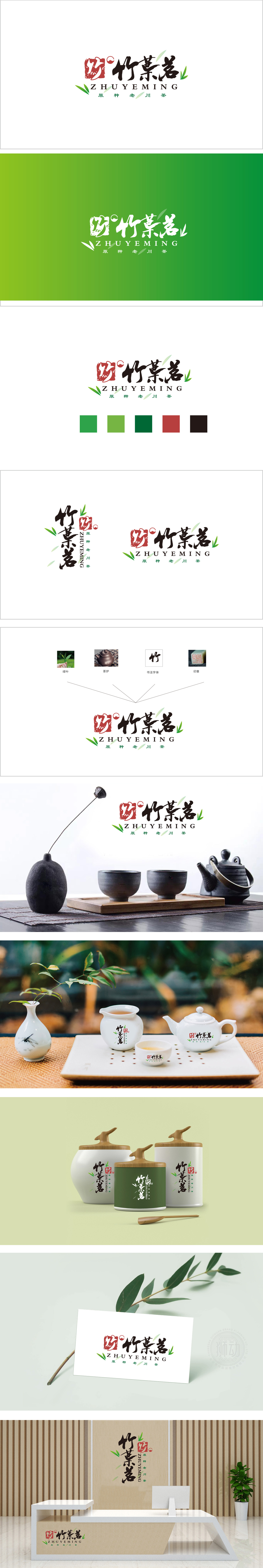
狮动设计以鲜嫩的茶叶叶片为原型,直接点明产品核心——茶叶的“天然属性”与“原产地鲜活感”。叶片舒展的形态暗示茶叶的鲜嫩与生长环境的纯净,绿色作为主色调传递出健康、自然、原生态的品牌定位,“竹”既是品牌名“竹叶茗”的核心字眼,也承载了中国传统文化中“竹”的象征意义——高洁、坚韧、清雅,与茶文化中“淡泊宁静”的精神内核高度契合。毛笔书法的笔触灵动自然,既展现汉字的美学魅力,又隐喻茶叶口感的“清冽、回甘”,赋予产品人格化的文化气质。以符号构建“茶叶的文化与自然双重价值”,这种将茶叶的自然本真与千年茶文化基因暴力拆解又精密重组的设计,简直是用视觉语言给“原种老川茶”写了一首立体史诗!
Lion design takes fresh and tender tea leaves as the prototype, directly pointing out the "natural attributes" and "fresh sense of origin" of tea, the core of the product. The spreading form of leaves implies the freshness of tea leaves and the purity of the growing environment. As the main color, green conveys a healthy, natural and original ecological brand positioning. "Bamboo" is not only the core word of the brand name "Bamboo Leaf Tea", but also carries the symbolic meaning of "Bamboo" in China traditional culture-noble, tough and elegant, which is highly consistent with the spiritual core of "indifferent and quiet" in tea culture. The strokes of brush calligraphy are smart and natural, which not only shows the aesthetic charm of Chinese characters, but also symbolizes the "crisp and sweet" taste of tea, giving the product a personalized cultural temperament.


扫码或拨打添加客服微信


