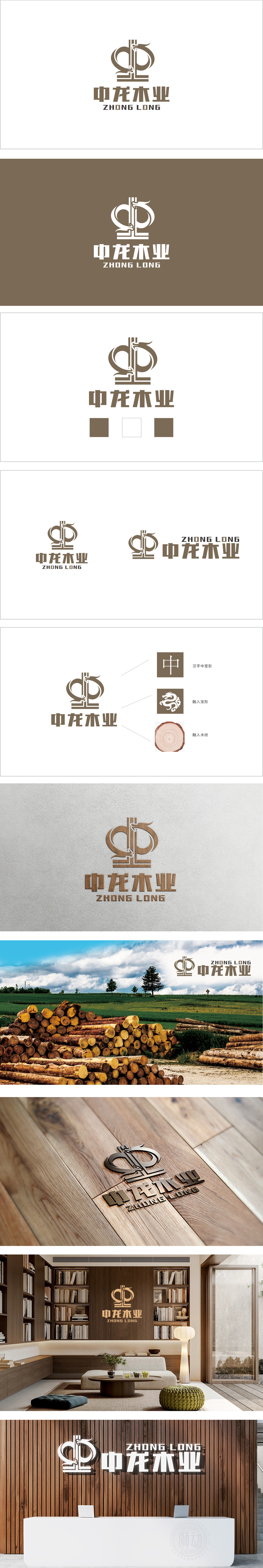
狮动设计通过“中”字为骨架,通过线条的弧度与对称结构,既保留了汉字的识别性,又赋予其流动感。龙形图腾的抽象融入,既象征“龙”的威严与祥瑞,用极简线条传递力量感,与“中龙”品牌名深度绑定,暗合家具行业对“尊贵、品质”的价值追求。棕色系配色,直接点明“木材加工、家具制造”的行业属性,让消费者快速联想到自然、环保、实木等核心卖点。多元素的和谐统一,通过“中”的沉稳、“龙”的精神、“木”的本质,构建了一个既有文化底蕴又极具行业辨识度的品牌形象。
Lion design takes the Chinese character "Zhong" as the skeleton, and through the radian and symmetrical structure of lines, it not only retains the recognition of Chinese characters, but also gives them a sense of fluidity. The abstract integration of the dragon totem not only symbolizes the majesty and auspiciousness of the dragon, but also conveys the sense of strength with minimalist lines, which is deeply bound with the brand name of Zhonglong, and coincides with the value pursuit of "dignity and quality" in the furniture industry. The brown color scheme directly points out the industrial attributes of "wood processing and furniture manufacturing".


扫码或拨打添加客服微信


