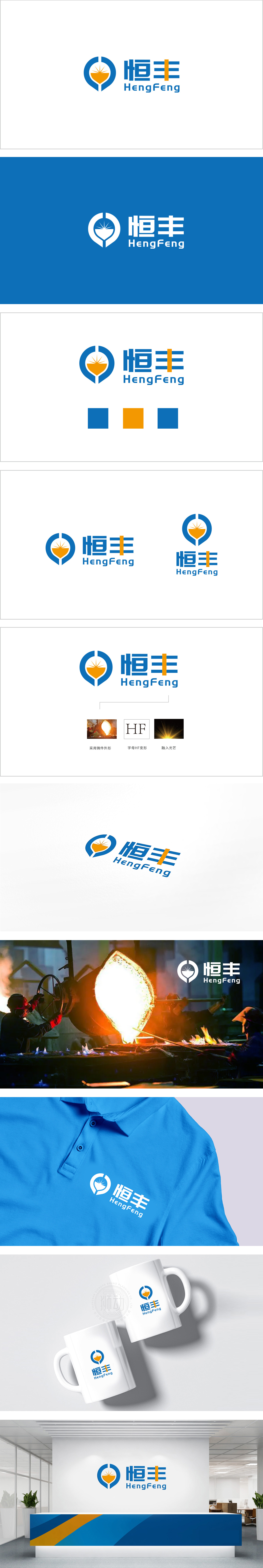
狮动设计以蓝色圆环为基底,嵌套橙色铸件,轮廓,放射状光芒与底部弧形形成“日出/熔炉”意象。赋予标志“向上、发展、引领”的动态,铸件造型直接关联制造、重工等核心业务,而圆环+底部尖角的组合又暗含“盾牌”的稳固感,隐喻品牌可靠、安全的行业属性。通过“行业符号可视化+品牌基因符号化(HF)+精神价值意象化(光芒)”的三重设计逻辑,传递专业、技术、信任,符合重工、制造行业对“可靠感”的需求,形成“形(符号)→意(内涵)→境(愿景)”的完整表达。
Liondesign is based on blue ring, nested with orange castings, and the outline, radial light and bottom arc form the image of "sunrise/furnace". Giving the logo the dynamic of "upward, development and leading", casting modeling is directly related to core businesses such as manufacturing and heavy industry, while the combination of ring and bottom sharp corner implies the sense of stability of "shield", which implies the reliable and safe industry attributes of the brand.Through the triple design logic of "industry symbol visualization+brand gene symbolization (HF)+ spiritual value imagery (radiance)", the specialty, technology and trust are conveyed.


扫码或拨打添加客服微信


