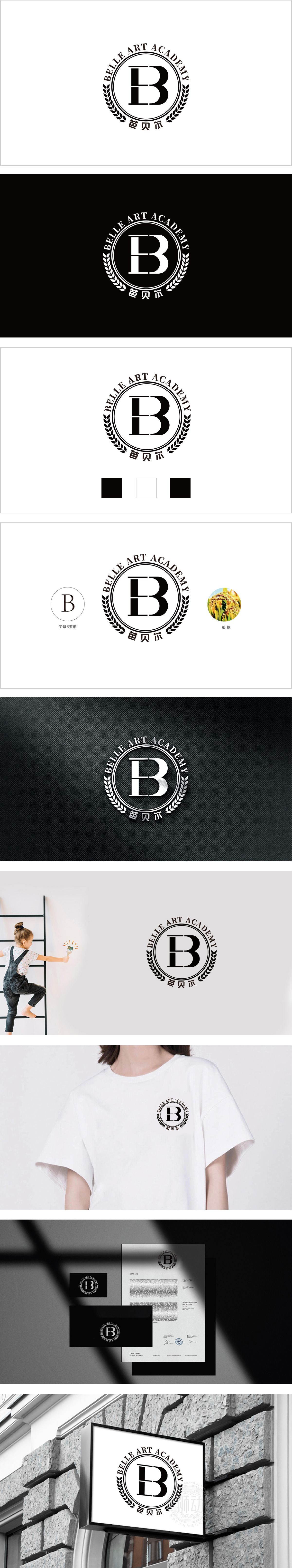
狮动设计以“字母B变形”作为设计起点,既保留了字母的识别性,又赋予其“稳健、对称”的视觉感受,暗合教育机构追求的“规范化、专业性”。线条分割形成类似“书本翻开”的意象,与教育培训的“知识传递”属性自然呼应,图形本身兼具,麦穗在视觉上是“收获、成长”的经典符号。两者结合,通过自然元素传递出“教育如耕耘,收获成长”的品牌价值观。整个标志通过“核心字母变形+自然符号隐喻+徽章式布局”的组合,成功将“教育的专业性”、“艺术的美感”、“成长的理念”浓缩为视觉符号。
Lion design takes "letter B deformation" as the design starting point, which not only retains the recognition of letters, but also gives them a "steady and symmetrical" visual experience, which coincides with the "standardization and professionalism" pursued by educational institutions. Line segmentation forms an image similar to "book opening", which naturally echoes the "knowledge transfer" attribute of education and training. The figure itself has both, and the ear of wheat is a classic symbol of "harvest and growth" in vision. The combination of the two conveys the brand values of "education is like cultivation, harvest and growth" through natural elements. Through the combination of "core letter deformation+natural symbol metaphor+badge layout".


扫码或拨打添加客服微信


