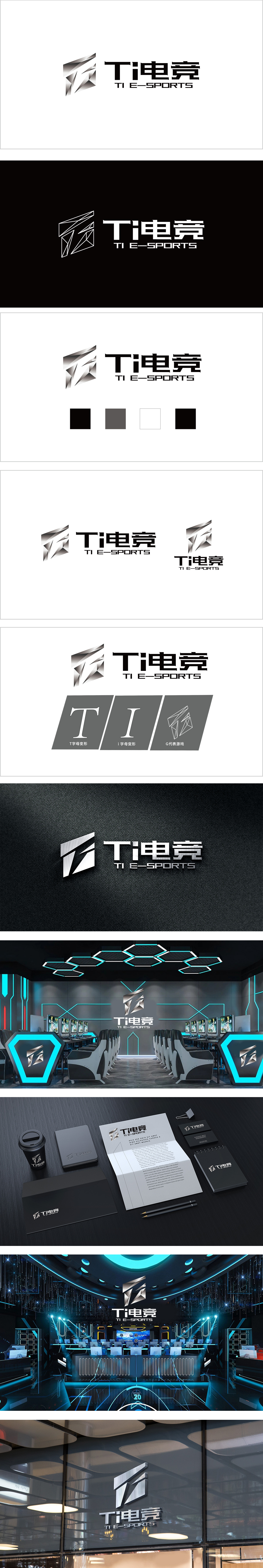
狮动设计采用锐角多边形组合为核心,呈现出强烈的“钻石切割”质感——多组倾斜的银色三角面通过光影叠加,形成立体破碎的视觉效果。这种设计巧妙传递了电竞行业的速度感、科技感与竞技对抗性:银色渐变从深灰到亮白的过渡,赋予图形金属材质的光泽感,既像破碎的晶体,又似未来科技的能量碎片,暗喻电竞领域的“突破”与“锋芒”。黑白银三色的经典搭配,传递出“专业、成熟、国际化”的品牌调性。整体以几何切割的动态图形传递竞技的“锋芒”,以金属光影强化科技属性,以简洁文字确保品牌识别,整体风格既“专业克制”又“充满力量”。
Lion design takes the combination of acute polygons as the core, showing a strong "diamond cutting" texture-multiple groups of inclined silver triangles are superimposed by light and shadow to form a three-dimensional broken visual effect. This design subtly conveys the sense of speed, science and technology and competitive antagonism in the e-sports industry: the transition of silver gradient from dark gray to bright white gives the graphic metal a sense of luster, which is like a broken crystal and energy fragments of future science and technology, implying a "breakthrough" and "edge" in the e-sports field. The classic combination of black, white and silver conveys the brand tonality of "professionalism, maturity and internationalization".


扫码或拨打添加客服微信


