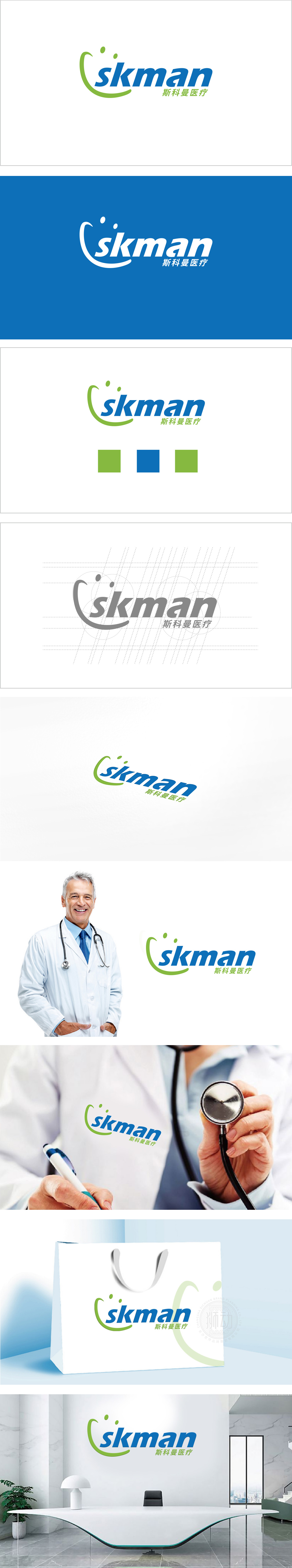
狮动设计采用流畅的绿色曲线形似上扬的嘴角,直观传递“关怀、安心、积极康复”的品牌态度,增强亲和力。圆点元素:弧线内侧的两个绿色圆点,既像抽象的“细胞”“分子”,呼应医疗行业的科学属性,又如同“眼睛”或“光点”,象征“关注生命细节”“点亮健康希望”,赋予图形层次感与故事性。绿色作为主色调,既是医疗行业的经典色(代表生命、健康、自然),传递温和、可靠的品牌气质。整体通过 “图形传递情感、字体承载专业” 的协同设计,塑造了“专业、安心、充满希望”的品牌形象。
Lion design adopts a smooth green curve shaped like an upward corner of the mouth, which intuitively conveys the brand attitude of "caring, peace of mind and active rehabilitation" and enhances affinity. Dot element: The two green dots on the inner side of the arc are like abstract cells and molecules, echoing the scientific attributes of the medical industry, and like eyes or light spots, symbolizing "paying attention to the details of life" and "lighting up health hopes", giving graphics a sense of hierarchy and story. As the main color, green is not only a classic color in the medical industry (representing life, health and nature), but also conveys a gentle and reliable brand temperament.


扫码或拨打添加客服微信


