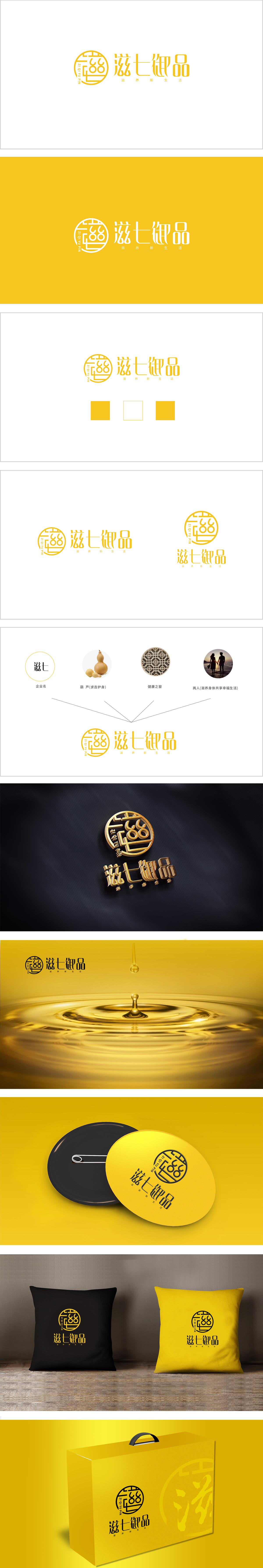
狮动设计将“御”字为核心进行变形设计,通过篆刻印章式的线条结构,构建出对称、稳重的视觉框架:通过圆形外框强化了“尊贵、专属”的联想,符合保健品对“品质感”“信赖感”的调性需求。圆形不仅象征圆满、和谐(契合“滋养”的健康诉求),也暗合传统养生文化中“天人合一”的理念;线条的穿插形成类似“回纹”的装饰感,传递出文化传承的厚重感,帮助品牌建立“中式养生”的差异化认知。金色在视觉上传递出华贵、高端、温暖的感受,既符合“御品”的高端定位,将品牌与传统养生智慧深度绑定,同时锚定现代人“亚健康调理”的痛点,突出“传统为体、现代为用”的差异化价值。
Lion Design takes the word "Yu" as the core to carry out deformation design, and builds a symmetrical and steady visual frame through the seal-cutting line structure; it strengthens the association of "dignity and exclusiveness" through the circular outer frame, which meets the tonality requirements of health products for "quality sense" and "trust sense". The circle not only symbolizes perfection and harmony (which accords with the health demand of "nourishing"), but also coincides with the concept of "harmony between man and nature" in traditional health preservation culture; The interweaving of lines forms a decorative feeling similar to "palindrome", conveys the heavy feeling of cultural inheritance, and helps the brand to establish a differentiated cognition of "Chinese health preservation".


扫码或拨打添加客服微信


