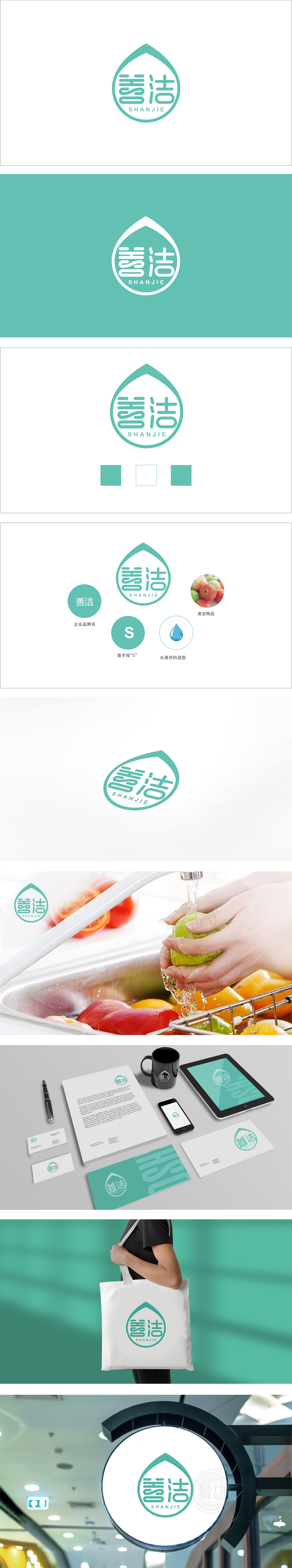
狮动设计以流畅的水滴轮廓为外框,形成“外具象+内抽象”的层次结构。水滴作为清洁类产品的核心视觉符号,既直观传递“洁净、去污渍”的功能属性,又通过柔和的弧线造型避免工业感,赋予品牌“温和、安全”的情感联想。整套设计以低饱和度的青绿色为主色调,搭配白色背景与局部蓝色水滴点缀,构建出“自然、纯净、专业”的视觉印象。“善洁”用一滴水滴的曲线,勾勒出品牌与用户的情感契约——这组标识系统的设计,堪称“小而精”的视觉叙事典范。。
Lion design takes the smooth outline of water droplets as the outer frame, forming a hierarchical structure of "external figuration+internal abstraction" As the core visual symbol of cleaning products, water droplets not only convey the functional attributes of "cleaning and stain removal" intuitively, but also avoid industrial feeling through soft arc modeling, giving the brand "gentle and safe" emotional association. The whole design takes turquoise with low saturation as the main color, with white background and local blue water droplets embellishment, to construct a "natural, pure and professional" visual impression.


扫码或拨打添加客服微信


