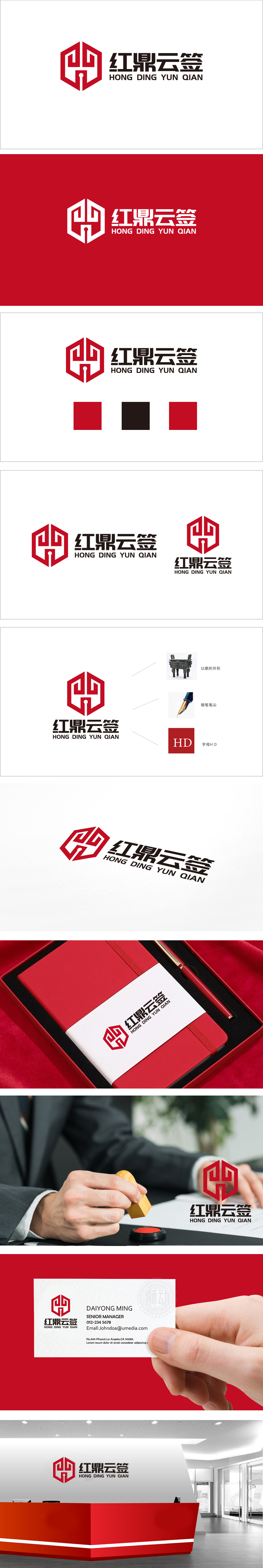
狮动设计采用“鼎”的经典形态为原型,六边形外轮廓(呼应鼎的方正稳重特质),既保留了“鼎”所象征的权威、诚信与契约精神,又通过几何化简化使其更具现代科技感,避免传统元素的沉重感。钢笔笔尖与“签”的功能联想,巧妙将“书写、签署”这一核心业务动作可视化。“钥匙孔”的细节巧思:笔尖底部的“钥匙孔”图形,隐喻“开启、授权、安全”,暗示平台在签约过程中的保障性,赋予品牌“值得信赖的契约守护者”的联想。整体通过“鼎(权威与诚信)+ 笔尖(签署与书写)+ 钥匙孔(安全与授权)”的三重意象叠加,构建了“红鼎云签”作为“具备传统契约精神的现代电子签约平台”的品牌定位。
Lion design takes the classic shape of Ding as the prototype, and the hexagonal outline (echoing Ding's square and steady characteristics) not only retains the authority, honesty and contract spirit symbolized by Ding, but also makes it more modern in science and technology through geometric simplification and avoids the heavy feeling of traditional elements. The pen tip is associated with the function of "signing", which skillfully visualizes the core business action of "writing and signing". The details of "keyhole" are ingenious: the "keyhole" figure at the bottom of the pen tip means "opening, authorization and security", implying the supportability of the platform in the signing process and giving the brand the association of "trustworthy contract guardian".


扫码或拨打添加客服微信


