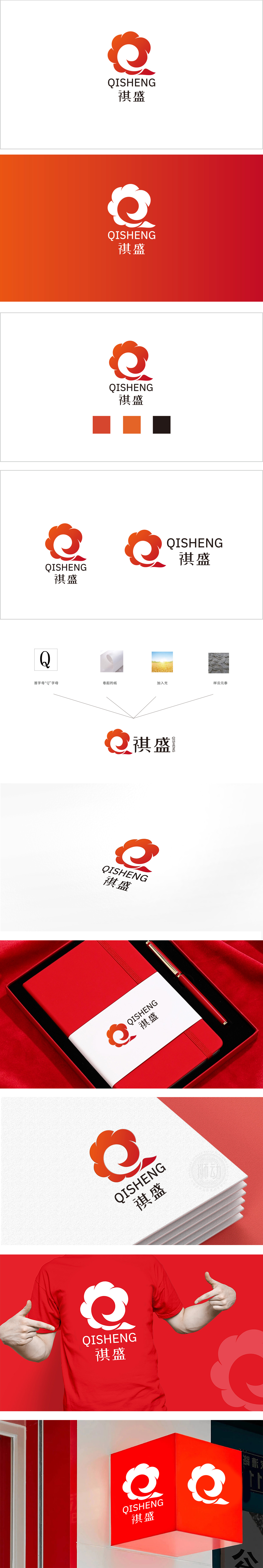
狮动设计以橙红色渐变的“花瓣状螺旋”为核心,由舒展的花瓣构成,形态饱满且富有动感,既保留了传统花卉图案的吉祥寓意(如象征繁荣、绽放、圆满),又通过流畅的曲线与螺旋结构打破传统对称,更显现代活力。花瓣以顺时针方向螺旋汇聚,传递出积极向上、持续发展的品牌精神。橙色代表温暖、活力与亲和力,红色则承载着中国传统文化中的吉祥、喜庆、权威意象,两者结合既满足了品牌对“本土文化认同”的传递,“祺盛”二字:“祺”意为吉祥、安福,“盛”意为繁荣、兴盛,组合传递“吉祥兴盛”的品牌愿景。图形中的花卉、螺旋上升结构与“盛”的“繁荣”含义直接呼应,红色调则强化了“吉祥”的文化联想,传统底蕴与现代审美的平衡之作。
Lion design takes the orange-red gradient "petal-shaped spiral" as the core and consists of stretched petals. It is full and dynamic, which not only retains the auspicious meaning of traditional flower patterns (such as symbolizing prosperity, blooming and perfection), but also breaks the traditional symmetry through smooth curves and spiral structures, showing more modern vitality. The petals gather in a clockwise spiral, conveying the brand spirit of positive and sustainable development. Orange represents warmth, vitality and affinity, while red carries the images of auspiciousness, jubilation and authority in China traditional culture. The combination of the two not only satisfies the brand's transmission of "local cultural identity", but also the word "Qi Sheng": Qi means auspiciousness and happiness, and Sheng means prosperity and prosperity, and the combination conveys the brand vision of "auspiciousness and prosperity.


扫码或拨打添加客服微信


