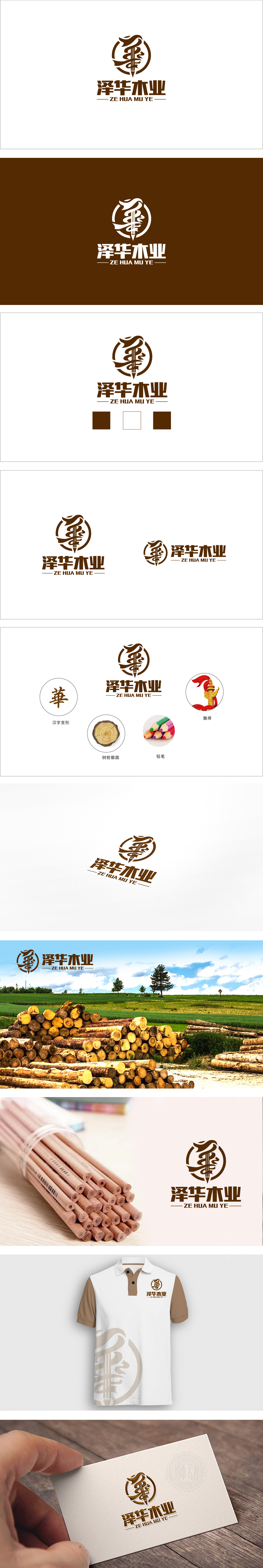
狮动设计以“华”字为视觉核心,通过书法笔触的艺术化变形,木材属性:以“树桩年轮”的弧形线条为基底,棕褐色调与木纹肌理感强化木业行业属性,年轮的圈层结构也隐喻“品质沉淀”与“可持续发展”。工艺与匠心:竖笔巧妙转化为“铅笔”形态,笔尖朝上的尖锐感打破传统木纹的厚重,暗示木业设计的“创意性”与“精工细作”,实现“原材料”与“加工工艺”的视觉连接。整体字形保留书法的飞白与连笔,外圈圆形轮廓既像传统印章的“圆满”意象,又通过局部线条的打破,传递“传统与现代结合”的品牌调性。通过“树桩年轮”“木纹色调”“铅笔工具”三大核心符号,层层递进地构建“木业(原材料)-设计(加工)-品质(成品)”的产业逻辑链,整体展现出“传统工艺与现代设计结合”的品牌定位。
Lion design takes the word "Hua" as the visual core, and through the artistic deformation of calligraphy strokes, the wood properties: based on the arc lines of "tree stump rings", the tan tone and the texture of wood grain strengthen the wood industry properties, and the ring structure of tree rings also metaphors "quality precipitation" and "sustainable development".Craftsmanship and ingenuity: the vertical pen is skillfully transformed into a "pencil" shape, and the sharp feeling of the upward tip breaks the traditional heavy wood grain, suggesting the creativity and meticulous work of wood design, and realizing the visual connection between "raw materials" and "processing technology".


扫码或拨打添加客服微信


