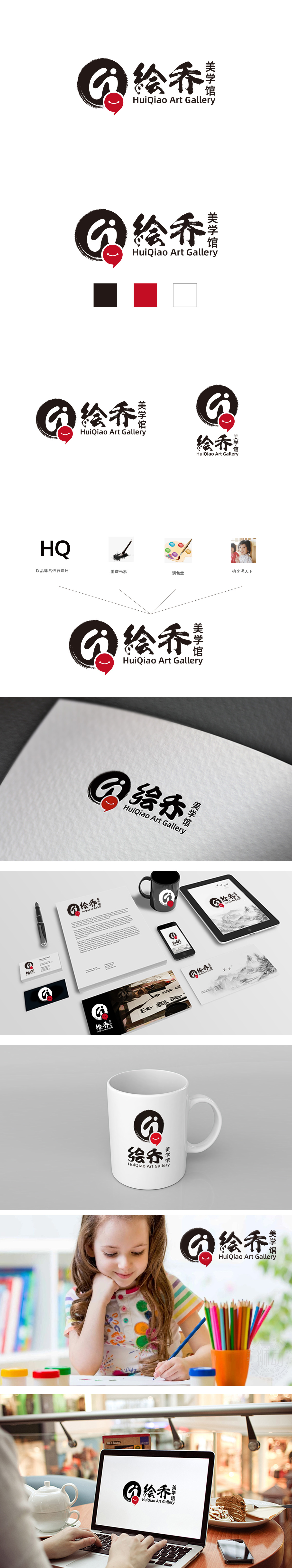
狮动设计以黑色圆形为基底,内部有一个抽象的“Q”字母轮廓,线条采用毛笔笔触风格,边缘带有自然的墨晕效果,体现传统水墨的写意感。红色点缀:圆形右下方有一个红色对话框图标,内部嵌入白色笑脸图案,增添活泼与亲和力,形成“传统+现代”的对比。黑、白、红三色为主,经典且具有视觉冲击力。黑色象征专业与沉稳,红色代表活力与创造力,白色背景则确保整体简洁清晰,突出主体元素。整个Logo通过“水墨笔触+书法字体”传递传统艺术底蕴,通过“对话框+笑脸”和简洁英文体现现代亲和力,整体风格兼具文化厚重感与活力,清晰传达了“绘乔美学馆”作为艺术机构的核心定位:连接传统与现代,提供专业、生动的美学体验。
Lion design adopts a circle as the core carrier, with blue gradient and geometric lines, showing a sense of science and technology, professionalism and trust as a whole, which meets the brand demands of the driving training industry for safety, standardization and reliability. The main color of blue and white is classic and steady. The core figure in the circle is composed of the abstract outline of the steering wheel: symmetrical Y-shaped lines and circular nesting, which not only intuitively echoes the core operating tool (steering wheel) in the driving scene, but also forms a dynamic rotating visual effect through the radian and cross structure of the lines, which is a metaphor for the industrial essence of "driving" and "sports". Through the triple binding of "symbol image (steering wheel)+brand meaning (zero)+color emotion (blue and white)".


扫码或拨打添加客服微信


