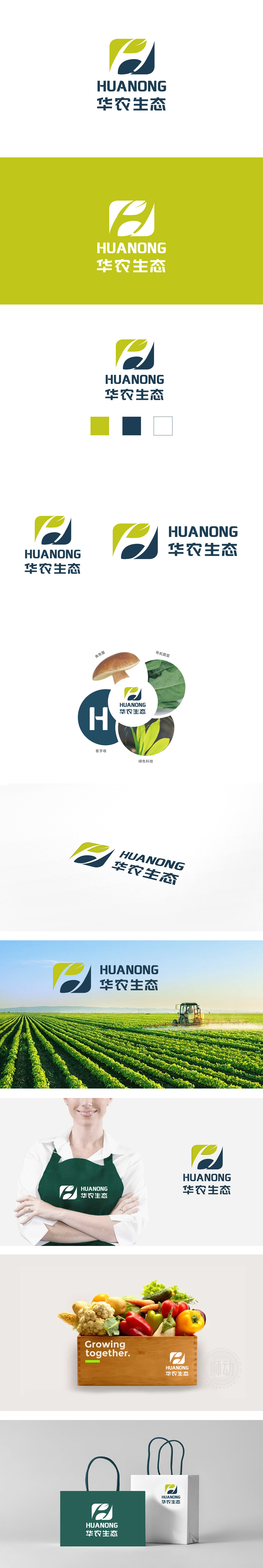
狮动设计以几何色块与曲线构成,整体呈方形外轮廓,内部融合了 “叶子”“飞鸟”“流水” 三大意象:绿色区域:,形似一片舒展的叶子,直接关联“生态”“农业”的自然属性,绿色象征生命力、环保与可持续发展。蓝色区域:通过流畅的白色线条切割,既像一只展翅的飞鸟,传递“活力”“自由”与“发展”的动态感;又可联想为蜿蜒的流水,暗合农业对水资源的依赖,采用 “绿色+深蓝色+白色” 的经典组合,色彩对比明确且和谐:整体符合“生态农业”领域“自然友好+科技赋能”的双重属性。通过 “自然意象(叶、水)+ 动态符号(飞鸟)+ 科技色彩(蓝)+ 稳定结构(方形)” 的组合,精准诠释了“华农生态”的核心价值——以生态为根基、以科技为驱动、以发展为目标。
Lion design is composed of geometric color blocks and curves, with a square outline as a whole, and three images of "leaves", "birds" and "flowing water" are integrated inside: green area, which looks like a stretched leaf and is directly related to the natural attributes of "ecology" and "agriculture", and green symbolizes vitality, environmental protection and sustainable development. Blue area: cut by smooth white lines, it is like a bird spreading its wings, conveying the dynamic sense of "vitality", "freedom" and "development"; It can also be associated with winding running water, which coincides with the dependence of agriculture on water resources. The classic combination of "green+dark blue+white" is adopted.


扫码或拨打添加客服微信


