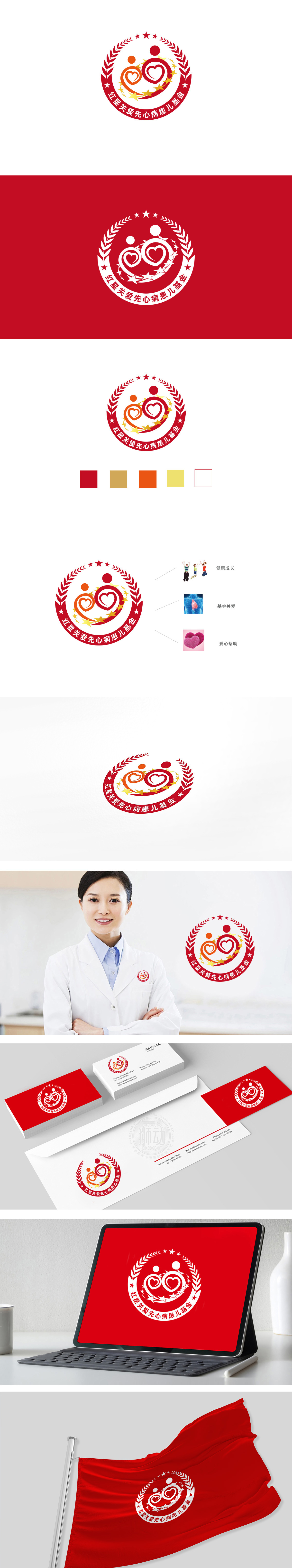
狮动设计以“人”为核心,传递关爱本质。主体形象:抽象化的“大人与孩子”共生关系,标志中心由两个红色渐变人形构成,通过线条的环抱姿态形成紧密联结。两人的躯干部分巧妙融入心形轮廓:既直观呼应“心脏病患儿”的核心关怀对象,又隐喻“以爱为核心”的救助理念,实现“人与心”的双重符号叠加。色彩渐变与线条流动,人形从橙色到红色的渐变过渡,既增强视觉层次,又通过暖色系统传递温暖、希望的情感;环绕人形的红色橄榄枝,不仅是国际通用的“和平、守护”象征,其向上延伸的形态也暗喻“生命力”与“成长”,与“救助患儿、重获健康”的目标形成呼应。整体将品牌属性的精准匹配公益与儿童关怀。
Lion design takes "people" as the core and conveys the essence of caring. Subject image: the abstract symbiotic relationship between "adults and children", the logo center is composed of two red gradual humanoid figures, which are closely connected through the embracing posture of lines. The trunk parts of the two men are ingeniously integrated into the heart-shaped outline: they not only intuitively echo the core care object of "children with heart disease", but also metaphor the rescue concept of "taking love as the core" to realize the double symbol superposition of "man and heart".


扫码或拨打添加客服微信


