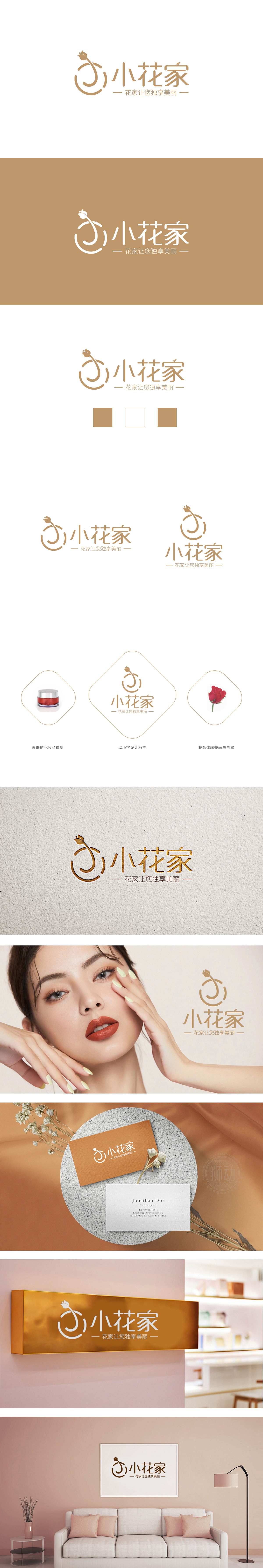
狮动设计采用花朵与环形的巧妙结合:以简约流畅的线条勾勒出一朵含苞待放的花,花茎自然延伸为环形轮廓,既像花朵生长的动态轨迹,又似呵护美丽的“拥抱”意象,传递出品牌对“自然、温柔、守护”的价值主张。环形结构也隐含“圆满、循环”的寓意,可能暗指日化产品带来的持续呵护与美好体验。整体采用纤细柔和的金色线条,与“独享美丽”的细腻情感诉求相契合,符合日化产品对“温和、高级”的调性追求。“小花家”的LOGO通过自然符号(花、环形)传递产品理念、通过温暖字体与配色建立情感温度、通过“Slogan+家”的场景化表达拉近用户距离。
Lion design uses a clever combination of flowers and rings: a flower in bud is outlined with simple and smooth lines, and the stem naturally extends into a ring outline, which is not only like the dynamic trajectory of flower growth, but also like caring for the beautiful "hug" image, conveying the brand's value proposition of "nature, gentleness and protection". The ring structure also implies the meaning of "perfection and circulation", which may imply the continuous care and beautiful experience brought by daily chemical products. The overall use of slender and soft golden lines is in line with the delicate emotional appeal of "exclusive beauty" and the tonal pursuit of "gentleness and advanced" in daily chemical products.


扫码或拨打添加客服微信


