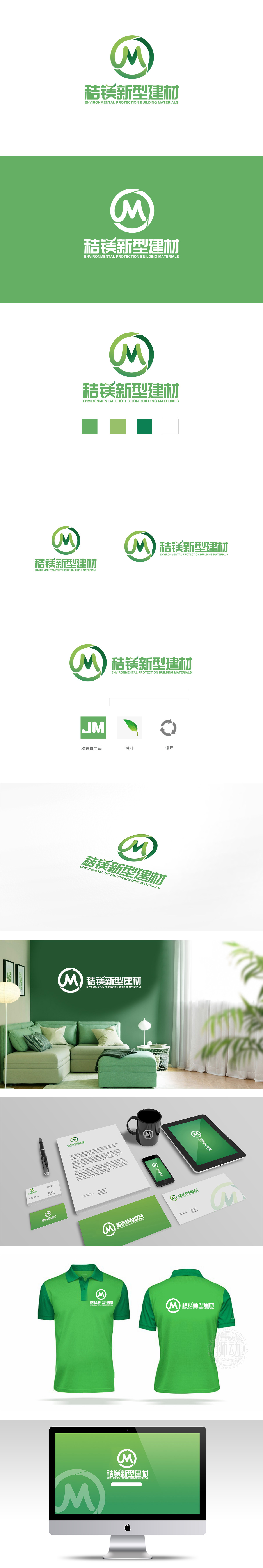
狮动设计通过首字母“M”变形,行业辨识度高,环形既是循环,也是“桔镁”品牌的保护与包容象征;曲线条(环形、叶片弧度)传递“环保的柔和与生命力”,实现理性与感性的视觉平衡。通过**“符号抽象化→元素融合化→价值可视化”**的设计路径,精准传递了“桔镁新型建材”以“首字母为品牌基因、环保为核心价值、循环为产品理念”的品牌形象。绿色主调与简洁图形的组合,既符合建材行业的专业属性,又凸显“新型环保”的差异化定位。
Lion design is deformed by the initial letter "M", which has a high degree of industry recognition. The ring is not only a cycle, but also a symbol of the protection and tolerance of the "Orange Magnesium" brand; Curved strips (rings and blade radians) convey "softness and vitality of environmental protection" and realize the visual balance between rationality and sensibility. Through the design path of * * "symbol abstraction → element fusion → value visualization", the brand image of "Orange and Magnesium New Building Materials" with "initials as the brand gene, environmental protection as the core value and recycling as the product concept" is accurately conveyed.


扫码或拨打添加客服微信


