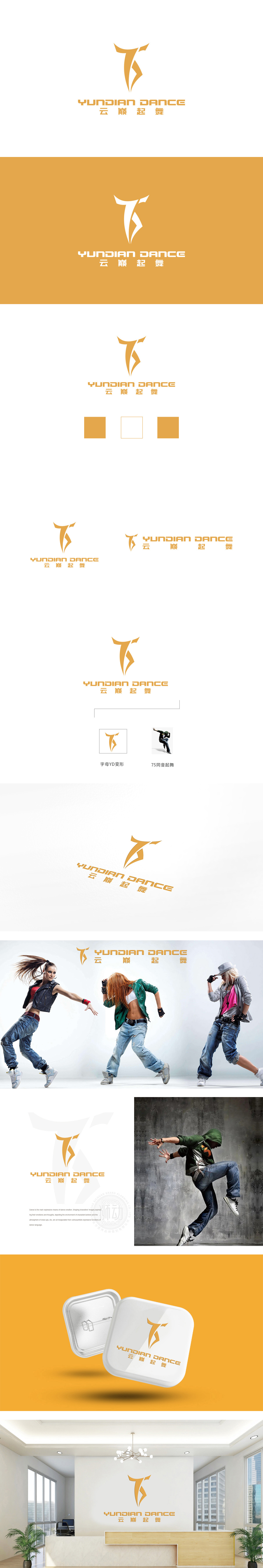
狮动设计采用起舞75的数字为骨架,通过线条的动态切割与转折,自然延伸出舞者的抽象形态——顶部的尖角似扬起的手臂或舞蹈头饰,中部的斜向分割线模拟身体扭转的动感,底部的分叉线条则像裙摆或腿部舒展的轨迹,整体形成“以字母为骨、以舞蹈为魂”的视觉符号,兼具识别性与故事性。采用金色渐变,增强高端感,线条锐利却不失流畅,刚硬的几何轮廓与灵动的曲线形成对比,既传递出“云巅”的挺拔向上,又体现“起舞”的轻盈飘逸,暗合“在巅峰之上起舞”的品牌主张。通过动态线条,精准传递出舞蹈的“运动、韵律、突破重力”核心特质,既满足了品牌识别的功能性,又传递了“高端舞蹈艺术”的情感价值。
Lion design uses the capital letter "T" as the skeleton, but through the dynamic cutting and turning of lines, the abstract form of dancers naturally extends-the sharp corner at the top is like a raised arm or a dance headdress, the diagonal dividing line in the middle simulates the dynamic twist of the body, and the bifurcated lines at the bottom are like the trajectory of a skirt or legs stretching, forming a visual symbol of "taking letters as the bone and dancing as the soul" as a whole, which is both recognizable and narrative. The golden gradient is adopted to enhance the sense of high-end, and the lines are sharp but smooth. The rigid geometric contour contrasts with the flexible curve.


扫码或拨打添加客服微信


