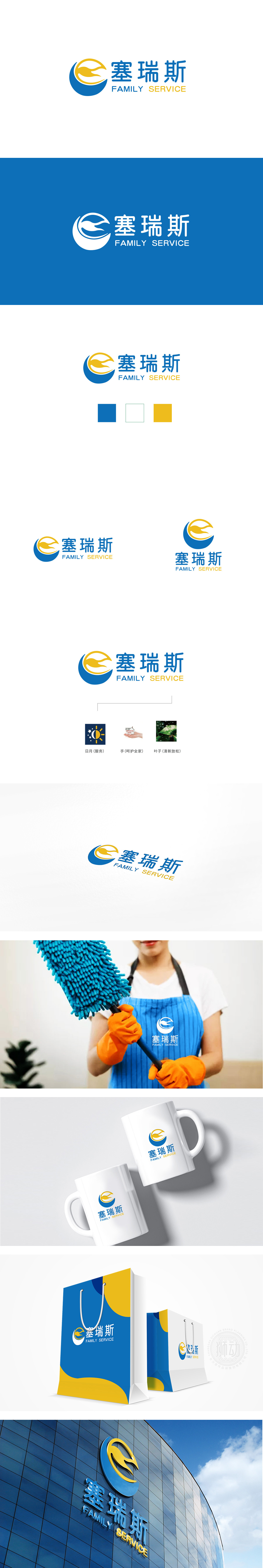
狮动设计采用蓝色圆形与黄色抽象线条构成,具有双重象征意义:蓝色圆形:外圈饱满的蓝色圆弧如同“保护罩”,既象征服务的包容性,也传递稳定、可靠的品牌气质,符合家政服务对“信任”的核心诉求。黄色抽象线条:线条流畅且呈向上趋势,形似抽象的“飞鸟”或“双手环抱”,既体现服务的轻盈与活力,也隐喻“守护家庭”的温暖感;黄色作为亮色,在蓝色背景中形成视觉焦点,增强品牌记忆点。 整体设计简洁而不简单,既有现代品牌的视觉美感,又通过符号与色彩的隐喻,将“可靠家政”与“家庭守护”的核心价值直观传递给用户。
Lion design is composed of blue circles and yellow abstract lines, which has double symbolic significance: blue circle: the full blue arc of the outer ring is like a "protective cover", which not only symbolizes the inclusiveness of service, but also conveys a stable and reliable brand temperament, which conforms to the core appeal of domestic service for "trust". Yellow abstract lines: the lines are smooth and upward, which are like abstract "birds" or "hands around", which not only reflects the lightness and vitality of service, but also symbolizes the warmth of "guarding the family"; As a bright color, yellow forms a visual focus on the blue background and enhances the brand memory. The overall design is concise but not simple.


扫码或拨打添加客服微信


