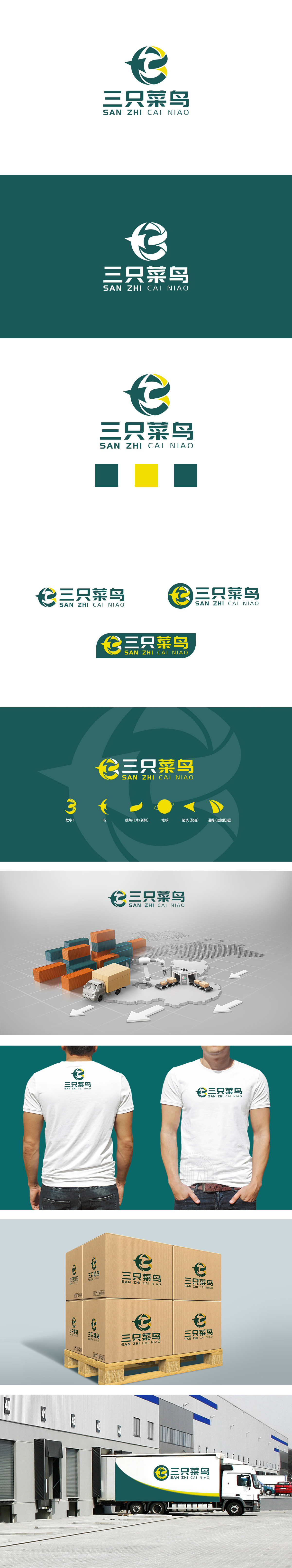
狮动设计将绿色环形结构搭配向内/向外的箭头元素(类似抽象的“e”),直观传递了物流行业的循环流转、高效周转特性,暗示货物从起点到终点的闭环运输过程,同时环形也象征“全链路覆盖”的服务能力。曲线与折线的交织增强了图形的运动感,绿色作为主色调传递“稳健、可靠”的品牌气质,而局部点缀的黄色则可能象征“速度、活力”,符合物流行业对时效性的追求。“菜鸟”的反差巧思:名称中的“菜鸟”本意为新手,但通过图形的专业设计(环形结构+箭头符号)形成反差,暗含“以新手的谦逊态度,提供专业成熟的物流服务”的品牌理念,既亲切易记,又融入了物流行业的核心属性(周转、速度、覆盖)。
Lion Design combines the green ring structure with the inward/outward arrow elements (similar to the abstract "E"), which intuitively conveys the circular circulation and efficient turnover characteristics of the logistics industry, implies the closed-loop transportation process of goods from the starting point to the end point, and at the same time, the ring also symbolizes the service ability of "full link coverage". The interweaving of curves and broken lines enhances the sense of movement of graphics. As the main color, green conveys the brand temperament of "stability and reliability".


扫码或拨打添加客服微信


