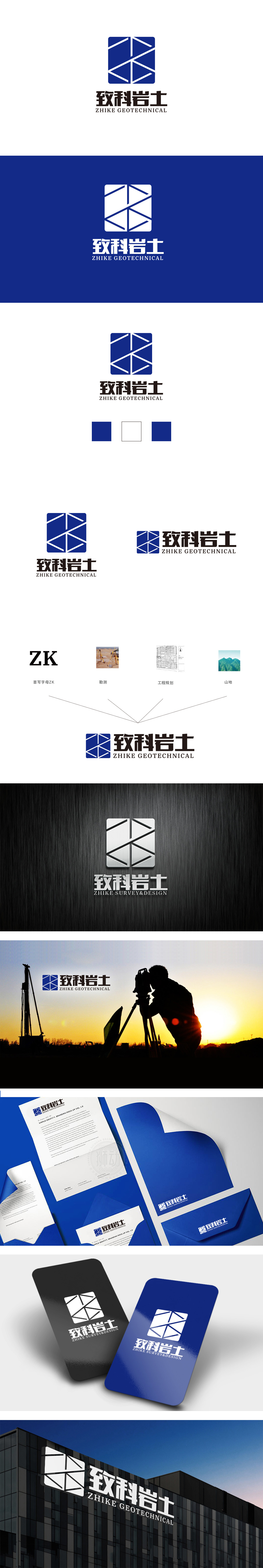
狮动设计采用深蓝色正方形为基底,正方形作为最具“稳定性”的几何图形,直接关联岩土工程行业对“结构稳固”“安全可靠”的核心诉求,视觉上传递出扎实、专业的企业形象。斜线的交错类似“网格”或“勘探线”意象,暗合岩土工程中地质勘察、结构测绘的专业动作,抽象化传递“技术分析”“精准测量”的业务内涵。通过图形(方形、交叉线条)、色彩(蓝色)、字体(黑体)的组合,即可让受众快速联想到“工程”“科技”“岩土”等关键词,符合品牌识别的核心目的,功能性与美学性的统一。
Lion design takes dark blue square as the base and square as the most "stable" geometric figure, which is directly related to the core demands of geotechnical engineering industry for "stable structure" and "safety and reliability", and visually conveys a solid and professional corporate image. The crisscross of diagonal lines is similar to the image of "grid" or "exploration line", which coincides with the professional actions of geological survey and structural mapping in geotechnical engineering and conveys the business.


扫码或拨打添加客服微信


