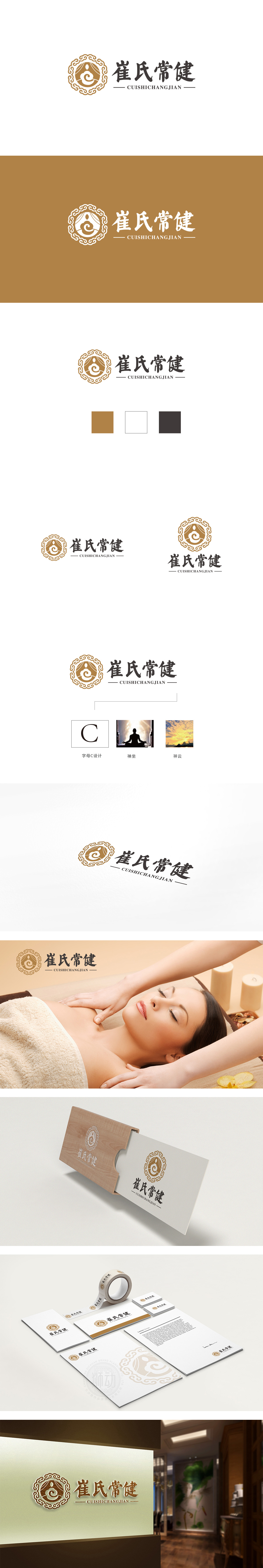
狮动设计采用金色缠枝莲纹环绕,既传递出“传承”“经典”的信任感,又通过对称、繁复的线条营造出典雅、庄重的氛围,符合保健品目标人群对“可靠”“专业”的心理预期。抽象化的“祥云”“螺旋”形态为主,线条流畅且向上延展,既象征“健康循环”“生命力”,又通过简洁的图形避免传统元素的陈旧感,增强现代审美适配性;崔氏常健”:姓氏+功能,构建信任与场景联想 。整体通过 传统符号的现代化转译、功能与情感的双重表达、信任与价值的视觉强化,以“传承”“专业”建立信任感,又以“健康”“日常”贴近消费场景,同时通过简洁的布局和平衡的色彩确保了商业应用中的实用性。
Lion design is surrounded by golden lotus patterns, which not only conveys the trust of "inheriting" and "classic", but also creates an elegant and solemn atmosphere through symmetrical and complicated lines, which meets the psychological expectations of the target population of health care products for "reliability" and "professionalism". The abstract "Xiangyun" and "spiral" form is the main form, and the lines are smooth and extended upward, which not only symbolizes "healthy cycle" and "vitality", but also avoids the obsolescence of traditional elements through concise graphics and enhances the modern aesthetic adaptability.


扫码或拨打添加客服微信


