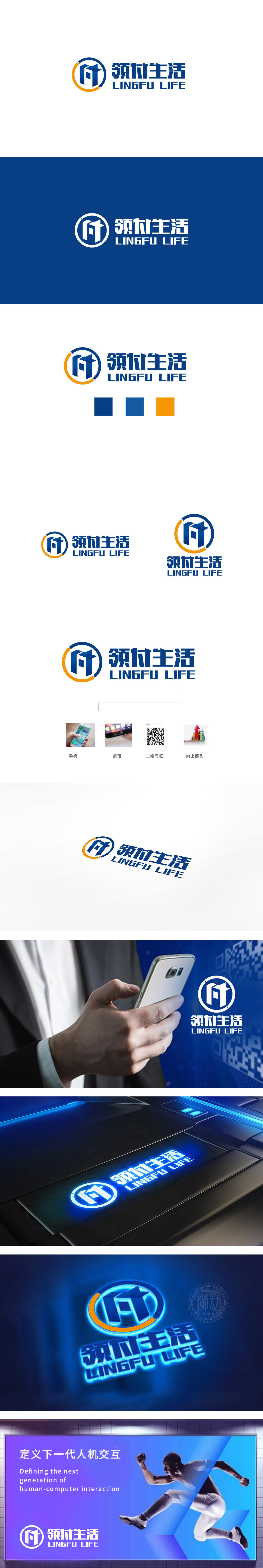
狮动设计通过两个几何化的“F”和“T”叠加构成:“F” 关联(金融)”(资金)”“(支付)”,符合“领付生活”的支付工具定位;“T” 若理解为“(交易),则强化了“科技驱动支付”的属性;立体堆叠的方块结构:类似积木或建筑模块,传递“稳定、可靠”的金融安全感,同时方块的拼接感暗示“连接”——连接用户、商户与资金流,符合支付平台的桥梁作用。橙色弧线与蓝色主环形成顺时针流动感,可隐喻“资金流转”“交易循环”“用户增长”,通过 “符号隐喻(F/T/环形)+ 色彩心理学(蓝橙)+ 结构语言(稳定方块+流动线条)”,将抽象的金融概念(支付、交易、信任、流动)转化为直观的视觉符号,同时通过“生活”文字与亮色平衡,精准定位“金融工具×生活场景”的品牌角色。
Lion Design consists of two geometric F and T: F is related (finance), fund and payment, which is in line with the payment tool positioning of "receiving and paying life"; If "t" is understood as "(transaction), it strengthens the attribute of" technology-driven payment "; Three-dimensional stacked block structure: similar to building blocks or building modules, it conveys a sense of "stable and reliable" financial security, and at the same time, the sense of block splicing implies "connection"-connecting users, merchants and capital flow, which is in line with the bridge function of payment platform.


扫码或拨打添加客服微信


