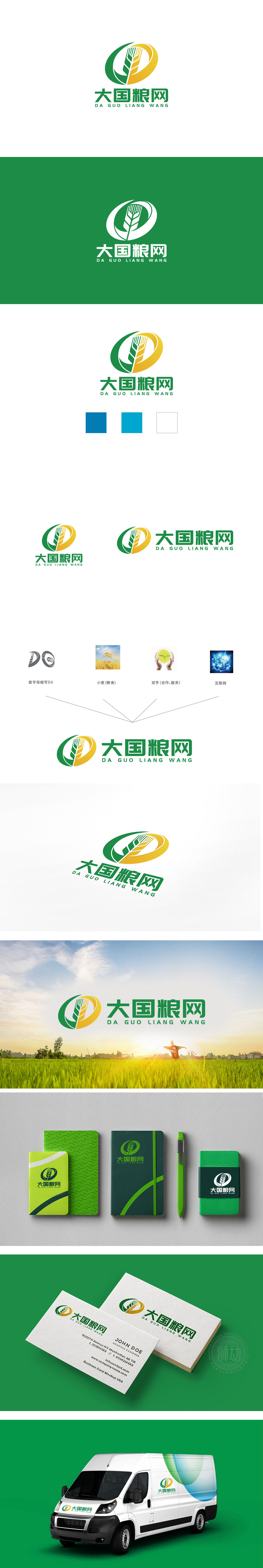
狮动设计对麦穗的艺术提炼——叶片舒展、麦芒清晰,既保留了农作物的自然形态,又通过几何线条的简化增强了现代感。麦穗作为农业的核心象征,直接点明“粮”的主题,传递出“粮食生产”“农业根基”的核心价值,符合“大国粮网”作为粮食领域平台的定位。“网”字则暗示平台的 互联网属性、网络化服务,表明品牌不仅关注传统农业,更强调数字化、现代化的粮食产业生态。绿色+黄色: 绿色是农业的标志性色彩(农田、作物),黄色是丰收的代表色(成熟的谷物、土地),二者搭配既符合大众对农业的视觉认知,又通过鲜明对比增强了标志的识别度。整体直接地传递出“专注农业、聚焦粮食”的品牌属性。
The artistic refinement of the ears of wheat (or rice) by the lion's movement design-the leaves are stretched and the awns of wheat are clear, which not only retains the natural form of crops, but also enhances the modernity through the simplification of geometric lines. As the core symbol of agriculture, the ear of wheat directly points out the theme of "grain" and conveys the core value of "grain production" and "agricultural foundation". which is in line with the positioning of "big country grain network" as a platform in the grain field. The word "net" implies the internet attribute and network service of the platform, indicating that the brand not only pays attention to traditional agriculture.


扫码或拨打添加客服微信


