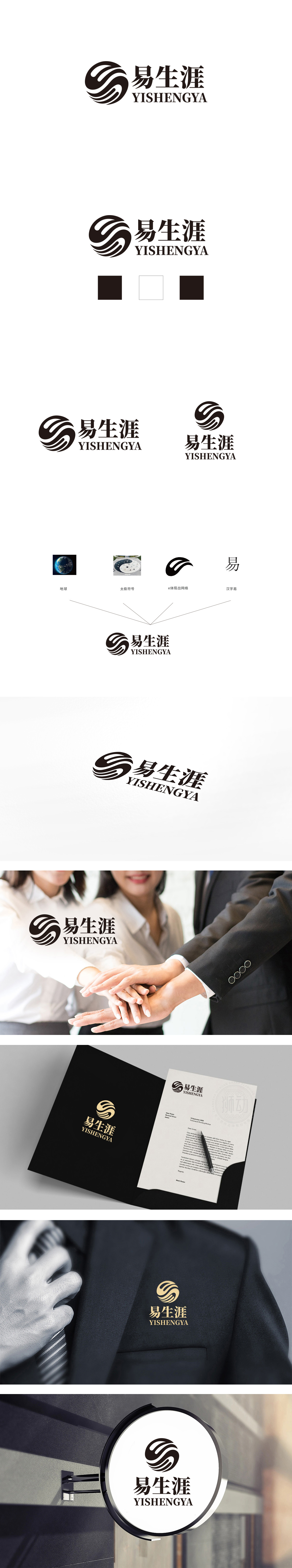
狮动设计采用地球的“球形轮廓”与太极的“阴阳环抱结构”被提炼为LOGO中心的圆形基底,既保留了太极“循环、平衡”的哲学意象(暗合“生涯规划”的动态平衡需求),又通过线条的流动性弱化了具象地球的地理属性,转化为更普适的“包容、全局”概念。圆形+三条曲线的组合,既是太极的抽象,也是“e”网络的变形,更是“生涯路径”的隐喻——单一符号承载多重解读,降低用户记忆成本;整体通过符号的整体气质隐含其内涵——太极的“变易”哲学、线条的“简易”美学、球形的“不易”稳定感,三者共同指向“易”字的文化底蕴,实现了从“文字符号”到“精神符号”的升华。
Lion design adopts the "spherical outline" of the earth and the "Yin-Yang embracing structure" of Tai Chi, which is refined into the circular base of the LOGO center. It not only retains the philosophical image of Tai Chi's "circulation and balance" (which coincides with the dynamic balance demand of career planning), but also weakens the geographical attribute of the concrete earth through the fluidity of lines and transforms it into a more universal concept of "tolerance and overall situation". The combination of circle and three curves is not only the abstraction of Tai Chi, but also the deformation of "E" network.


扫码或拨打添加客服微信


