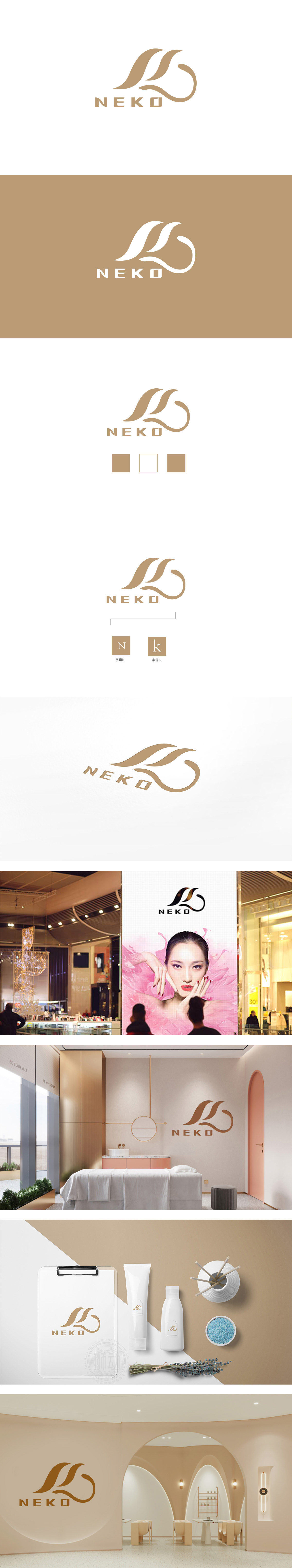
狮动设计采用流畅的曲线构成,形似飘逸的丝带、植物叶片或抽象的“水滴”形态,传递出柔和、轻盈、自然的视觉联想,符合日化产品常强调的“温和、亲肤、天然成分”等核心卖点。棕色系配色,传递出温暖、质朴、高端的质感,“Neko”在日语中意为“猫”,猫的形象常与“柔软、细腻、治愈”相关联,通过自然曲线+暖色调+简洁名称,建立了“温和、天然、中高端”的日化品牌印象,视觉符号与消费者对“安全、舒适、高品质”的日化产品需求高度契合。
Lion design is composed of smooth curves, resembling elegant ribbons, plant leaves or abstract "water drops", conveying soft, light and natural visual association, which conforms to the core selling points of daily chemical products, such as "gentleness, skin-friendly and natural ingredients". Brown color scheme conveys warm, simple and high-end texture. "Neko" means "cat" in Japanese, and the image of cat is often associated with "softness, delicacy and healing". Through natural curve+warm tone+concise name, the brand impression of "gentle, natural and high-end" is established, and the visual symbols are related to consumers' perception of "safety, comfort and high quality".


扫码或拨打添加客服微信


