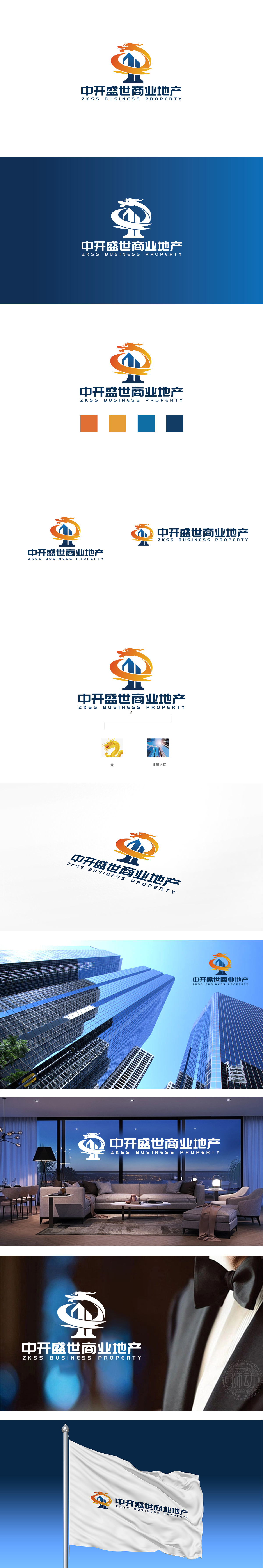
狮动设计以抽象化的龙首为视觉焦点,采用流线型线条勾勒出龙的动态轮廓:龙角上扬、张口威严,保留了传统文化中龙的尊贵与力量感,转而通过橙色到黄色的渐变色彩赋予其现代活力。龙身以环形环抱下方建筑,形成“守护”与“升腾”的双重意象,既呼应“盛世”的品牌寓意,也暗喻企业对商业资产的掌控力与成长性。深蓝色:传递专业、可靠、稳重的品牌气质,橙色象征活力、创造力与繁荣,黄色则关联“财富”“权威”,渐变效果增强了龙形的动感与层次感,整体以“龙+建筑”为核心符号,用现代设计语言重构了传统与商业的关系:既通过龙图腾唤醒文化认同,又以建筑符号和色彩对比确保行业属性的清晰传达。
Lion design takes the abstract dragon head as the visual focus, and uses streamlined lines to outline the dynamic outline of the dragon: the dragon horn rises and the mouth is majestic, which retains the dignity and strength of the dragon in traditional culture and gives it modern vitality through the gradual color from orange to yellow. The dragon body encircles the buildings below in a ring, forming a double image of "guarding" and "rising", which not only echoes the brand implication of "prosperous times", but also implies the control and growth of enterprises over commercial assets..


扫码或拨打添加客服微信


