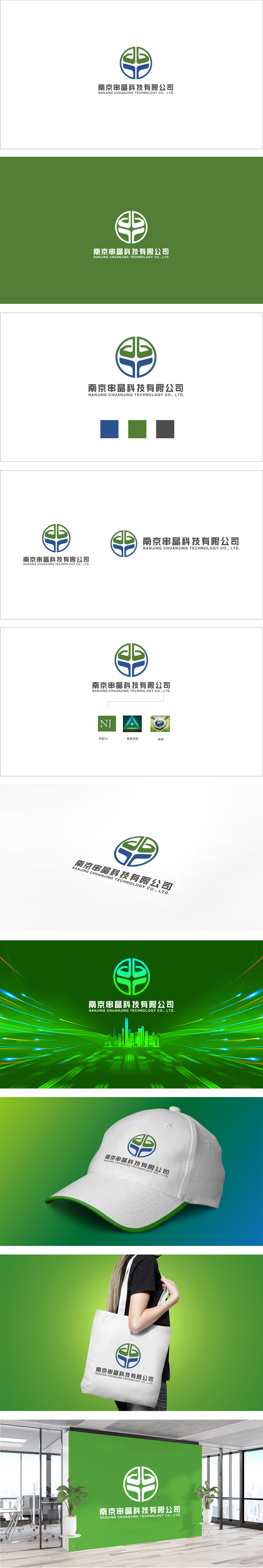
狮动设计以圆形为基底,由上下两组对称的几何图形构成:采用绿色渐变的“叶片”造型,线条流畅且富有生长感;蓝色渐变的“托举”形态,既像科技感的支架,又似“串”字的抽象化表达,传递出支撑、连接的意象。 整体通过对称结构和色彩分区,形成稳定且富有层次的视觉效果,体现科技公司的专业与严谨。绿色象征创新、成长与可持续,蓝色代表科技、信任与专业,两者搭配既符合科技行业属性,传递出企业兼具活力与稳重的品牌气质。该标志通过几何抽象、色彩隐喻与名称呼应,成功将“串晶”的行业特性与科技感融入设计,既展现了对品牌名称的巧妙解读,也传递出专业、创新的企业形象。
Lion design is based on a circle and consists of two groups of symmetrical geometric figures:Adopt the green gradient "blade" shape, the lines are smooth and rich in growth; The blue gradient "lift" form is not only like the support of scientific sense, but also like the abstract expression of the word "string", conveying the image of support and connection. As a whole, through symmetrical structure and color division, a stable and layered visual effect is formed, which reflects the professionalism and rigor of technology companies. Green symbolizes innovation, growth and sustainability, while blue represents technology, trust and professionalism. The combination of the two not only conforms to the attributes of the technology industry, but also conveys the brand temperament of the enterprise with both vitality and stability.


扫码或拨打添加客服微信


