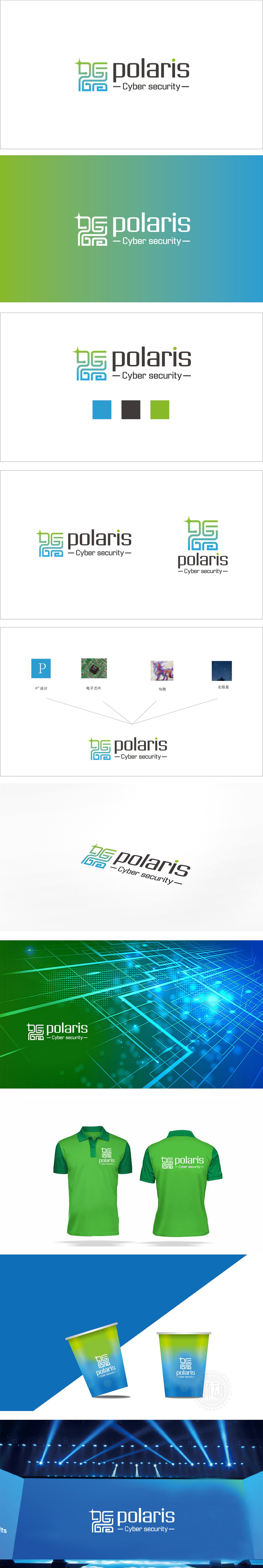
狮动设计以“PG”为基础进行变形,采用蓝绿渐变的流线型线条,既像电路板的精密回路,又似网络数据的流动路径,直观传递“技术驱动”和“数字防护”的核心属性。顶部的绿色星形符号形似“北极星”(Polaris本义),既呼应品牌名称,又象征“指引方向”“可靠守护”的安全定位,视觉上形成记忆点。蓝绿渐变:蓝色是科技行业的经典配色,代表信任、稳定与技术精密性;绿色则传递安全、防护与生命力,两者结合既符合网络安全行业的专业调性增添了创新活力。通过图形符号的隐喻性、色彩的行业适配性和排版的简洁高效,成功将品牌意象与“网络安全”的行业属性深度绑定,既展现了设计上的巧思,又精准传递了品牌核心价值——“为数字世界提供可靠的安全指引”。
Lion design is based on "PG" and adopts streamlined lines with gradual blue and green changes, which is not only like the precision circuit board.Road, like the flow path of network data, intuitively conveys the core attributes of "technology-driven" and "digital protection". The green star symbol of the Ministry looks like Polaris, which not only echoes the brand name, but also symbolizes "guidance" Direction "and" reliable protection "of the safe positioning, visually forming a memory point. Blue-green gradient: blue is the experience of science and technology industry Classic color matching represents trust, stability and technical precision; Green conveys safety, protection and vitality, and the combination of the two not only The professional tonality in line with the network.


扫码或拨打添加客服微信


