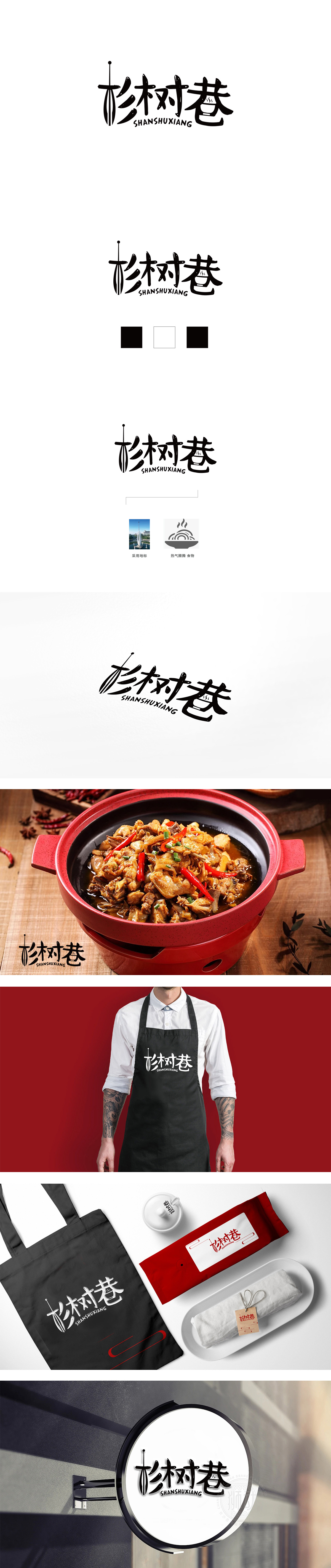
狮动设计采用手写体书法风格,笔画粗细不均、转折自然,既保留汉字结构的辨识度,又通过笔触的“书写感”传递出温暖、质朴的人文气息。“杉”作为核心意象,既指向“自然材质”(木材、原木色等),暗示品牌可能主打“原生态、健康”的产品属性(如食材、手作等);又以“树”的生长性隐喻品牌的生命力,或“街巷文化”的扎根感,赋予名称超越字面的精神内涵。巷”与“碗”:市井文化的浓缩符号“巷”本身代表“小而美”的社区空间、生活化场景,而“碗”作为饮食文化的核心载体,直接关联“餐饮、美食、日常消费”等行业属性。二者结合,精准定位了品牌的“社区化、亲民化”气质——不是高端奢华的“厅堂”,而是充满人情味的“街巷小馆”,用最朴素的符号唤起大众对“烟火气、归属感”的情感共鸣。
Liondesign adopts handwritten calligraphy style, with uneven strokes and natural turning, which not only retains the recognition of Chinese character structure, but also conveys a warm and simple humanistic atmosphere through the "writing feeling" of strokes. As the core image, "Chinese fir" not only points to "natural materials" (wood, log color, etc.), but also implies that the brand may focus on "original ecology and health" product attributes (such as ingredients, handmade products, etc.); With the growth of "tree" as a metaphor for the vitality of the brand, or the rooted sense of "street culture", the name is endowed with spiritual connotation beyond the literal meaning.


扫码或拨打添加客服微信


