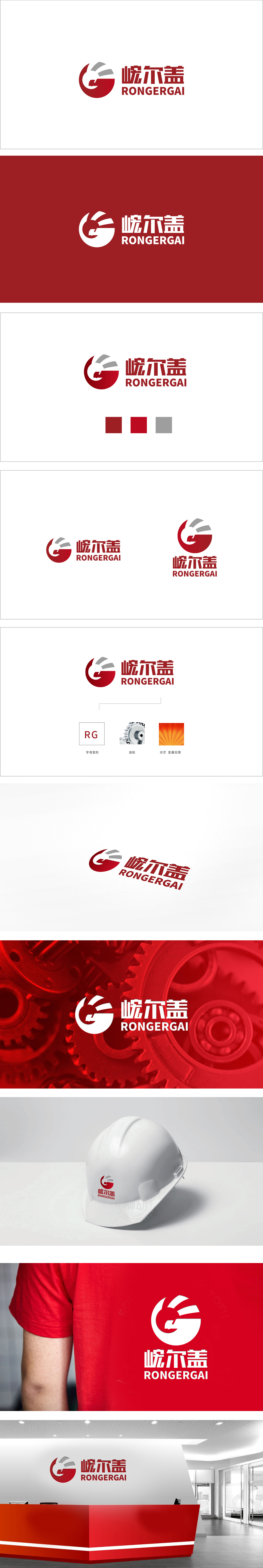
狮动设计以红色圆形为基底,内嵌抽象化的“鹰首”轮廓——鹰嘴锐利前倾,眼睑线条硬朗,整体呈现捕食者的警觉与冲击力,传递出品牌的果断与领导力。正红色(象征活力、权威)与深灰色(象征专业、科技)形成强烈视觉反差,同时圆形的“包容感”与线条的“延伸感”平衡了静态与动态,整体通过自然生物(鹰)的符号化抽象+几何线条的秩序感+色彩的情感化调和,成功将“机械设计”转化为“力量与科技的视觉语言”。
Lion design is based on a red circle, embedded with an abstract "eagle head" outline-the eagle's beak leans forward sharply and the eyelid lines are tough, showing the alertness and impact of predators as a whole, and conveying the brand's decisiveness and leadership. Positive red (symbolizing vitality and authority) and dark gray (symbolizing specialty and science and technology) form a strong visual contrast, and at the same time, the circular "sense of tolerance" and the line "sense of extension" balance the static and dynamic.


扫码或拨打添加客服微信


