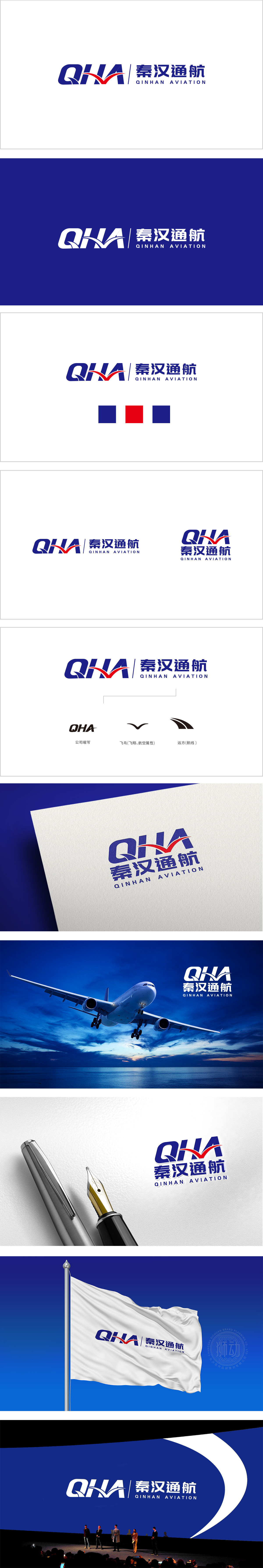
狮动设计以“QHA”为视觉核心,同时采用蓝色字体设计,形成稳定且具有延展性的整体结构。其中,红色“V”形飞鸟图案嵌套于字母“HA”之间,既是“飞翔”的具象化表达,又通过锐角与动态线条强化航空行业的速度感与升腾感,直观传递“通航”属性。 整体从“QHA”缩写(品牌标识)→“飞鸟”(行业属性)→“航线”(服务内涵),三层图形元素层层递进,精准传递“公司身份-航空属性-业务愿景”的完整信息,符合LOGO“简洁易懂+内涵丰富”的设计原则。实现现代航空科技与传统文化底蕴的微妙平衡。
Lion design takes "QHA" as the visual core, and the letters "Q", "H" and "A" are designed in fluent blue fonts, forming a stable and extensible overall structure. Among them, the red "V"-shaped bird pattern is nested between the letters "HA", which is not only a concrete expression of "flying", but also strengthens the sense of speed and ascension of the aviation industry through acute angles and dynamic lines, and intuitively conveys the "navigation" attribute. As a whole, from "QHA" abbreviation (brand LOGO) to "flying bird" (industry attribute) to "airline" (service connotation), three layers of graphic elements are progressive step.


扫码或拨打添加客服微信


