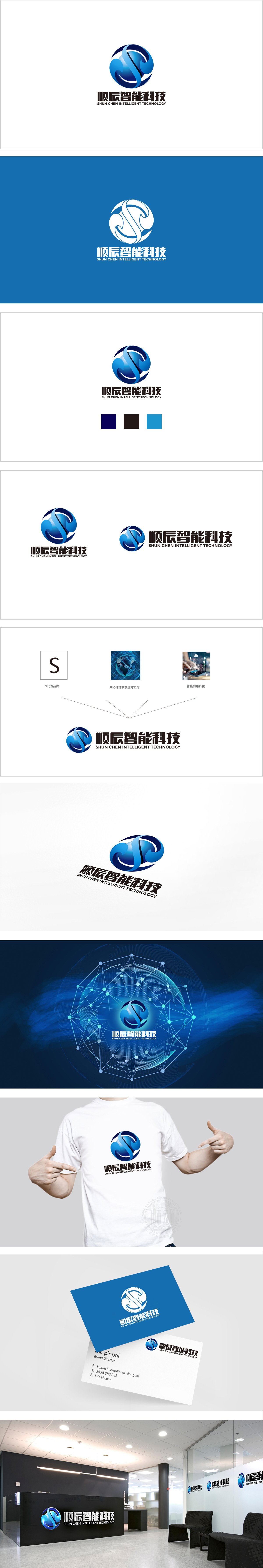
狮动设计以抽象球形为基底,通过蓝色渐变与白色线条切割,形成类似地球仪或科技星球的视觉联想,既暗合“智能科技”的行业属性(全球化、探索性),又传递出包容、完整的品牌气质。流动的“S”形曲线,传递品牌“顺势而为、持续进化”的理念。曲线与球形的负空间自然形成环形结构,隐喻“循环、无限”的科技特性。整体通过“流动的科技星球”这一核心意象,将“智能、连接、创新”的品牌内核转化为直观的视觉符号,色彩沉稳而不失活力,图形简洁却富有层次,成功塑造了专业、前沿且值得信赖的科技品牌形象。
Lion design is based on an abstract sphere, and it forms a visual association similar to a globe or a technological planet through blue gradient and white line cutting, which not only coincides with the industry attributes of "intelligent technology" (globalization and exploration), but also conveys an inclusive and complete brand temperament. The flowing "S" curve conveys the brand's concept of "keeping pace with the trend and continuing to evolve". Curve and spherical negative space naturally form a ring structure, which symbolizes the scientific and technological characteristics of "circulation and infinity" Through the core image of "flowing science and technology planet".


扫码或拨打添加客服微信


