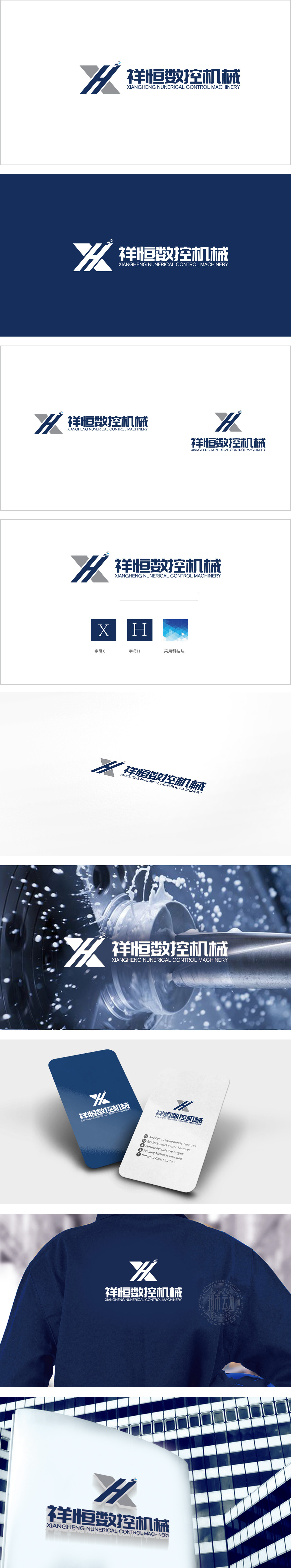
狮动设计以首字母“X”和“H”为核心,通过硬朗的几何线条与灰色三角块拼接,形成机械结构般的视觉张力。线条的交叉与切割感,既呼应了数控机械的精密加工属性,也传递出工业制造的力量感与稳定性。色彩与行业气质的匹配,暗示数控技术的智能化与科技感,整体通过“符号化+行业色+结构美学”的组合,—用设计语言直观传递“精密制造+智能数控”的核心竞争力。
Lion design takes the initials "X" and "H" as the core, and forms a mechanical visual tension by splicing tough geometric lines with gray triangles. The sense of crossing and cutting of lines not only echoes the precision machining properties of CNC machinery, but also conveys the sense of strength and stability of industrial manufacturing. The matching of color and industry temperament implies the intelligence and sense of science and technology of numerical control technology.


扫码或拨打添加客服微信


